The problem with using satellite photos for Bible (or other historical) maps lies in their photographic nature–they present the world as it is, with modern cities, agriculture, land use, and other infrastructure that didn’t exist in the ancient period that the maps are depicting. However, satellite maps are useful in showing “true-color” views and revealing features like transitions from deserts to wetlands.
If you’re not using satellite photos for the Bible maps you’re creating, you’re using other data, like elevation; indeed, with only elevation data, you can produce a variety of map styles. Shaded relief shows hills in a naturalistic way, approximating the look of satellite images. A hypsometric map, where the map color changes with elevation, also depicts this data, though I would argue that hypsometric maps can be misleading if they transition from green colors at low elevations to brown colors at higher elevations, since people have become used to satellite photos with these colors as depicting land cover.
The main problem with relying on elevation data (a digital elevation model, or DEM) is its relatively low resolution; until 2015, a 90-meter resolution (i.e., one pixel of elevation data corresponds to an approximate square 90 meters by 90 meters) was the highest resolution freely available worldwide (well, mostly worldwide). In 2015, the SRTM worldwide elevation data became available at a 30-meter resolution, or 9 times higher resolution than previously. Also in 2015, similar ALOS 30-meter data became available. If you’re willing to pay tens or hundreds of thousands of dollars, you can also find proprietary elevation data at resolutions of 5 meters. Most of us aren’t in a position to pay that kind of money, however, so I’m interested in free data.
Bible atlases produced before 2015 almost certainly use the coarser 90-meter resolution, while Bible atlases produced since (though as of late 2018 I’m not aware of any) would likely use the 30-meter resolution and can zoom in much further without becoming blurry.
However, 30 meters feels rough compared to the satellite imagery available in Google Maps, which is often at 30 centimeters. Even free imagery from the European Sentinel-2 project is available at 10 meters, or 9 times higher resolution than 30 meters.
DEM Enhancements
The question I have is whether it’s possible to enhance a 30-meter DEM to bring it closer to the high resolution that Google Maps is training us to expect on maps everywhere.
To answer that question, I turned to Terragen, 3D modeling software designed to render photorealistic landscapes. (I actually tried several different programs, but Terragen was the least confusing.) Terragen and similar programs procedurally improve resolution by adding fractal enhancement–in other words, they extrapolate from the available data to add plausible, if fake, detail. My process was the following:
- Find a high-resolution DEM to use as a reference for the output of the process.
- Downsample the DEM to 30-meter resolution to match the DEM available worldwide.
- Enhance and style the DEM in Terragen to mimic a satellite photo.
- Compare the output.
The U.S. Geological Survey has started making elevation data available at a 1-meter resolution for select parts of the United States. I picked a desert area near Dayton, Nevada, that roughly matches the terrain of ancient Israel (since Israel will probably be the subject of most Bible maps).
I converted the USGS .img file into a geotiff using gdal_translate and resampled it to 30-meter resolution using gdalwarp -tr 30 30 USGS_NED_one_meter_x27y436_NV_Reno_Carson_QL2_2017_IMG_2018.img nv-30.tif.
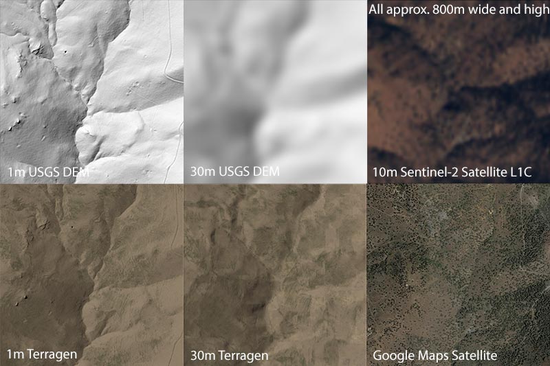
The result was two tiffs that I imported into Terragen. After that, I spent some time coloring and styling them, with the below results:

This image shows 1-meter shaded relief, 30-meter shaded relief with blurry bicubic resampling, 10-meter publicly available satellite photo that I slightly retouched, 1-meter colored and enhanced in Terragen, 30-meter colored and enhanced in Terragen, and the Google Maps view for this area.
I feel like the 30-meter Terragen view, which is what you could plausibly produce for Bible maps, looks pretty OK, actually–though a trained 3D artist would do better. The 1-meter data, while accurate, reproduces modern features like the road on the right side, which is unhelpful for Bible maps–mitigating modern features is the one of the main points of this exercise. While the 30-meter view doesn’t have all the detail of the 1-meter version, the rendering feels plausible to me.
Of course, “plausible” doesn’t mean “accurate,” and there’s the question of whether it’s ethical to enhance terrain in this way–you’re essentially inventing detail that doesn’t exist in the source data, which could mislead someone if they believe that the detail reflects reality. It depends how far you want to push the idea that all maps are in some way plausible fictions.
Scaling Up
What’s needed to implement this technique in production?
- A base map to use for coloring (I’d use Natural Earth II–I tried it in the Nevada scene and think it could work–but you could also use satellite imagery or your own colors).
- A way to export and reproject the finished product. My free version of Terragen can only export images 800 pixels wide; you’ll probably want to export them at over 10,000 pixels wide. And then you’ll need to stitch them together and reproject them to Web Mercator to display them in online mapping applications.
- A way to layer the images with other data (such as bodies of water and labels).
- A delivery mechanism (probably tiles over the Internet, as with Google Maps and most mapping applications).
Conclusion
This approach represents a plausible way to improve the resolution of Bible maps or other historical maps using only publicly available, free data. Although it creates some ethical problems, with proper disclosure it could potentially be a useful way to make Bible maps more compelling and zoomable.
Update March 2019: See the followup post, Using Machine Learning to Enhance the Resolution of Bible Maps.