In 1925, Gustaf Dalman collected 100 (actually 101) photos taken by the German Air Force in 1917 and 1918 into the book One Hundred German Aerial Photographs of Palestine. In addition to the photos, he also described what they depicted, and he cataloged the locations of over 1,200 similar photos taken around the same time.
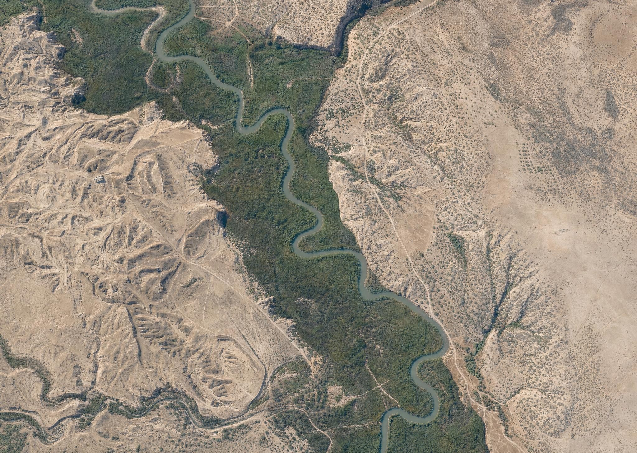
First, AI can colorize the photos. Below is what AI imagines the Jordan River looked like in March 1918, based on a historical photo. Compare it with a modern view of the same area, and you see much less vegetation across today’s Jordan Valley, with natural growth confined to a narrow strip around the Jordan’s watercourse. This kind of historical view gives you a better sense of what the area looked like in biblical times, assuming you were a bird. (The AI is also inventing sloppy details, so it’s creating immediacy at the expense of accuracy.) My instruction to the AI (GPT-Image-2) was to make each image look like it was taken with a modern iPhone.
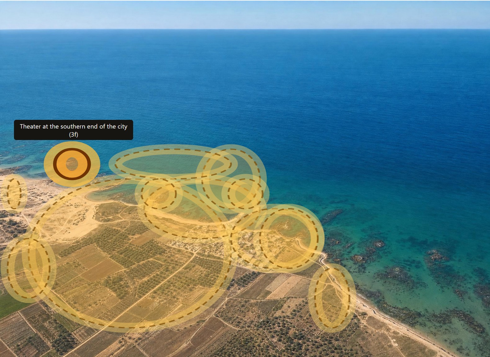
Second, AI can highlight all the features that Dalman mentions in his text. Below is Caesarea with all his annotations highlighted. Excavations at Caesarea wouldn’t happen until the 1950s, so you’re seeing the fishing village that it was at the time.
In the online book, you can click on any of the images to see the original black-and-white photos instead of the colorized AI images, if that’s how you want to roll.
Third, AI can translate the whole book from German into English. I don’t have a snappy image for you here, but it did a much better job than I would have.
Fourth, AI parsed the catalog at the end of the book so that it links to all the original photos at the Bavarian State Archives.
All the data and images for this book are in the public domain (at least in the United States), and the AI-generated images aren’t copyrightable, so you can enjoy and remix as you like. For the sake of clarity, I’m releasing the book under a CC0 license.
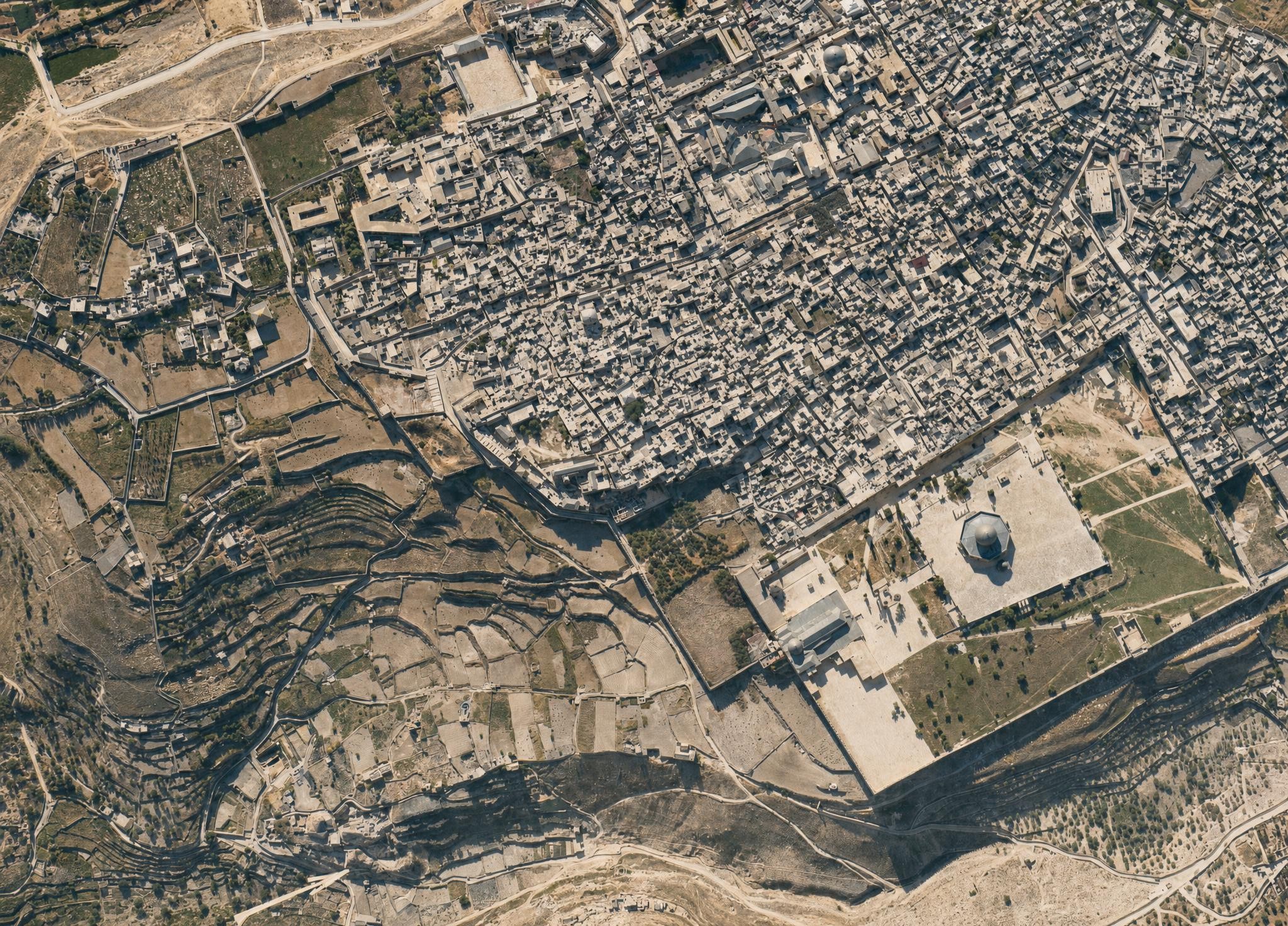
I leave you with this view of the Jerusalem’s Old City, which, again, shows much more open space than a modern view. I did have to keep reminding the AI that the Dome of the Rock didn’t have a golden dome at the time. The topography of the City of David (to the left of the Temple Mount) is clearly visible.
With last week’s release of Codex 5.3 and Opus 4.6, I had a new experience: an LLM showed itself to be a better programmer than I am. If you’ve seen my code, you may not think that’s a big achievement. But for the first time I saw, practically, how an AI could outperform me at something I take some measure of pride in. It was like Google’s Nano Banana Pro moment, but for coding.
Unlike my previous experiences with LLM coding, Codex 5.3 didn’t just have more familiarity with the syntax of a language or the functionality of a module; it solved an architectural problem better than I did. (It reused existing file artifacts instead of creating intermediate files.) Likely it had pulled the architectural pattern from somewhere else, but it was an elegant solution—superior to the workable-but-basic approach I’d been planning. In that instant, I felt like the future had arrived in a small way: it was better at this task than I was, not just faster at it.
LLMs have let me compress weeks of coding work into a few days. For the Bible Passage Reference Parser, I normally follow a six-month release schedule because changes take a lot of time, especially big refactoring changes like I’ve been planning for the next version (which moves language data to a different repo and adds an additional 2,000 languages). I’d been dreading this work for years because, with so many languages, dealing with exceptions would consume the bulk of the coding effort. I could barely manage exceptions with the 40 languages in the current repo, so adding 50x more didn’t sound fun.
However, Codex 5.3 made short work of the task, taking a few minutes to accomplish what would’ve taken me days of dedicated work, not that I’d ever be able to dedicate days straight to this project. I published the latest branch five months ahead of schedule (and remember, the schedule is six months long).
These models still make mistakes; you can’t yet let them code unattended. But their ability to plan ahead and write code according to that plan is now (at least sometimes) stronger than mine. A year ago, converting the reference-parser code from Coffeescript to Typescript involved a bunch of back-and-forth with ChatGPT; even with a straight 1:1 conversion, it still made questionable decisions that I corrected. With the latest models, LLMs are now correcting my questionable decisions.
Posted in AI, Code | Comments Off on Last Week, an LLM Out-Programmed Me
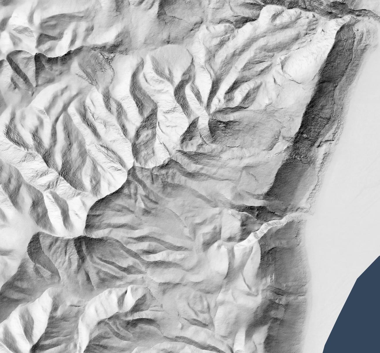
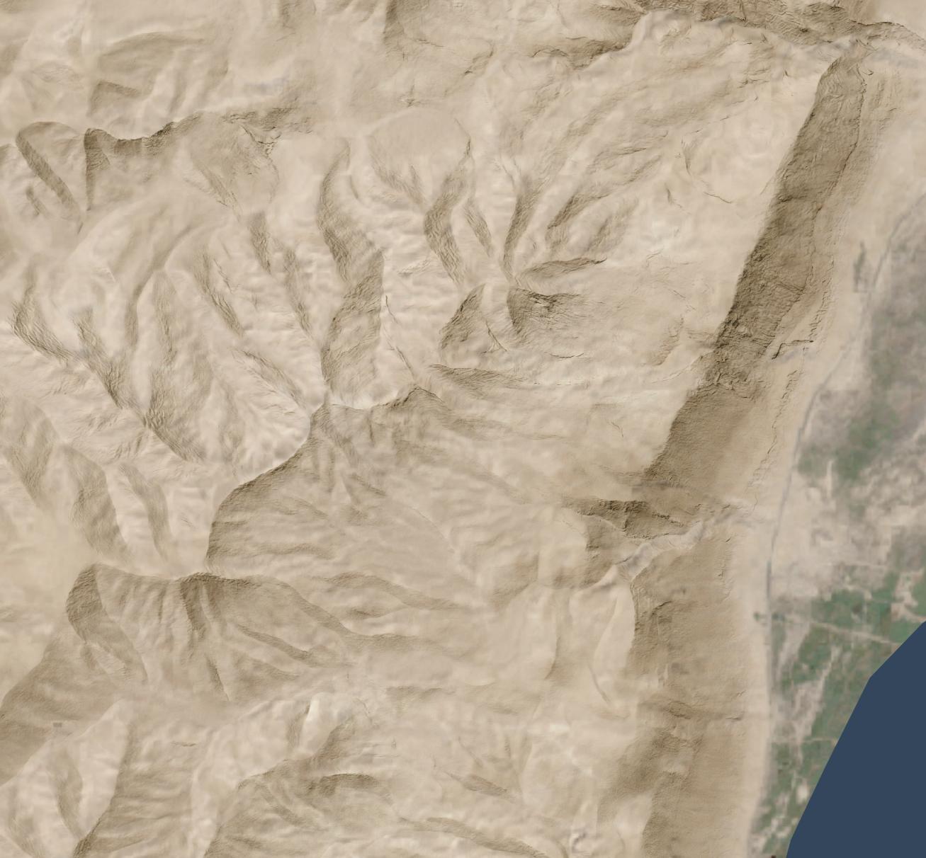
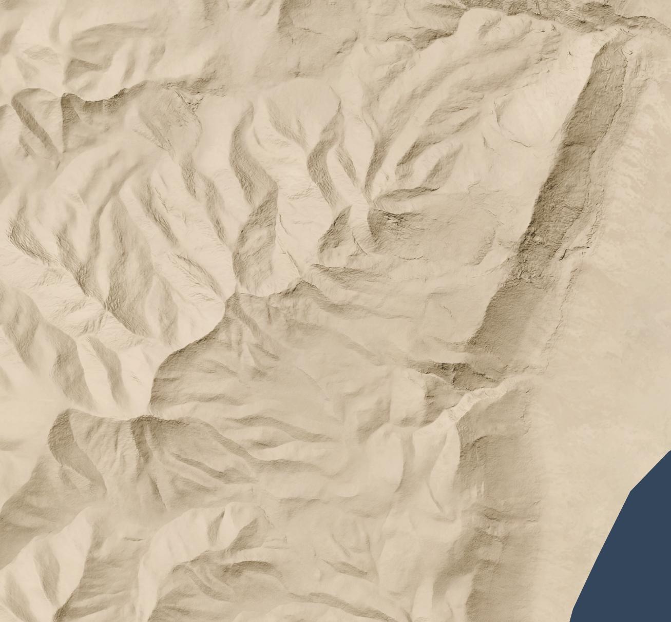
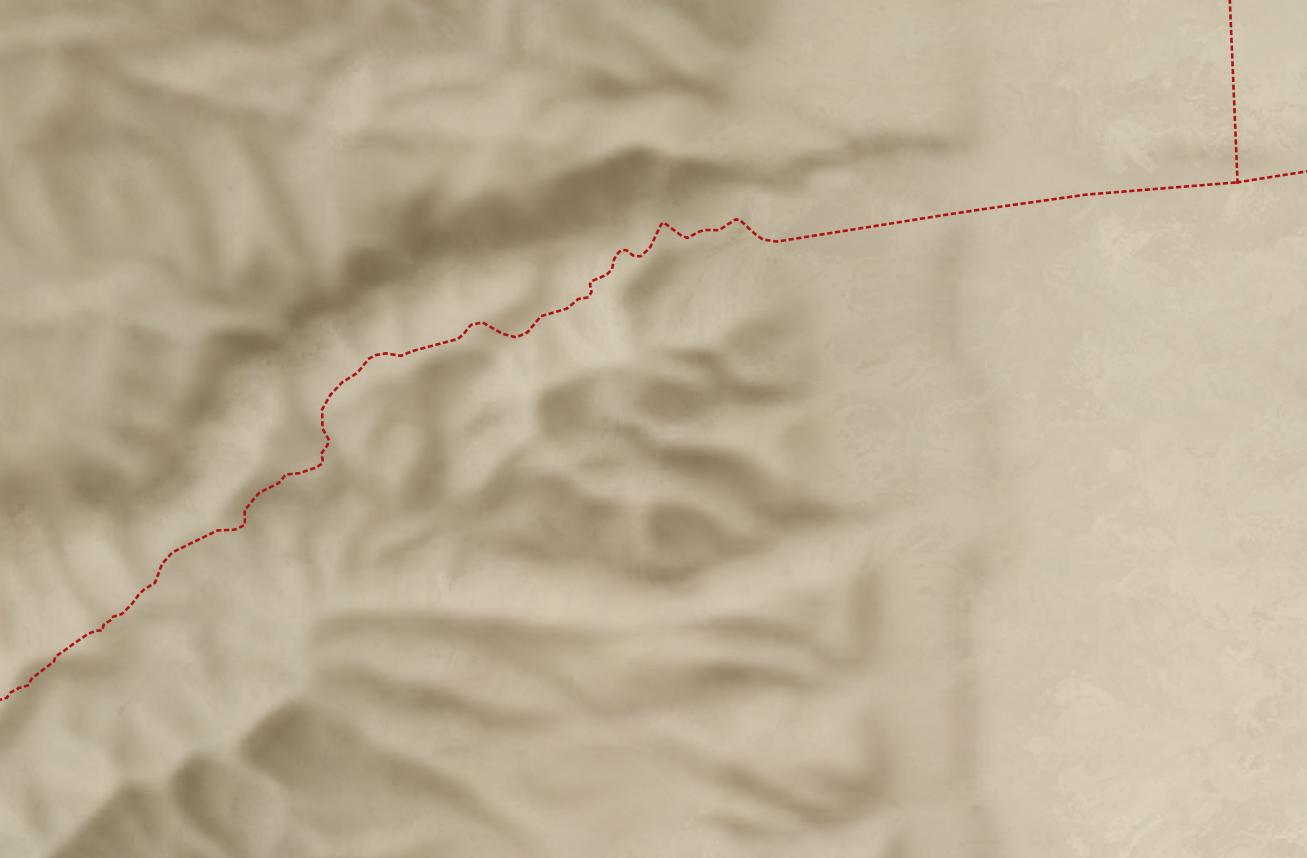
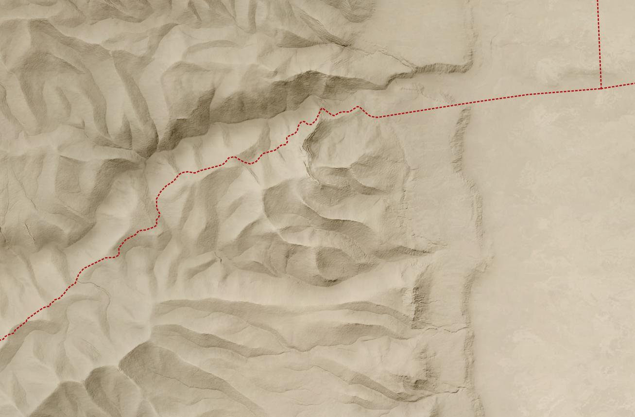
Let’s say you want a high-resolution (1.2 meters per pixel) hillshade like this one of cliffs and hills to the west of the Dead Sea:
1:13,000 scale
So that you can layer it over a satellite image (compare the original satellite image without hillshading added):
Or maybe over an idealized landscape with human features removed:
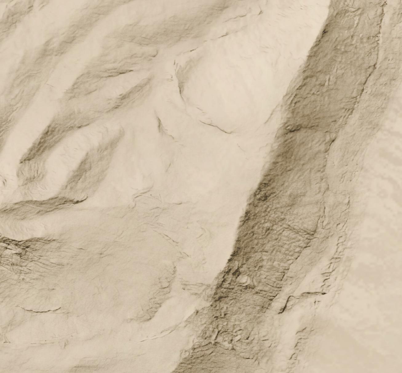
Here’s a full-resolution view (1:5,000 scale) of part of the cliff area.
But all you have is a lower-resolution (30 meters per pixel) hillshade like this:
Nano Banana Pro can help you out, if you’re willing to accept that it’s making up all the details it’s adding to your lower-resolution hillshade and that your high-resolution hillshade looks nice but doesn’t necessarily reflect reality.
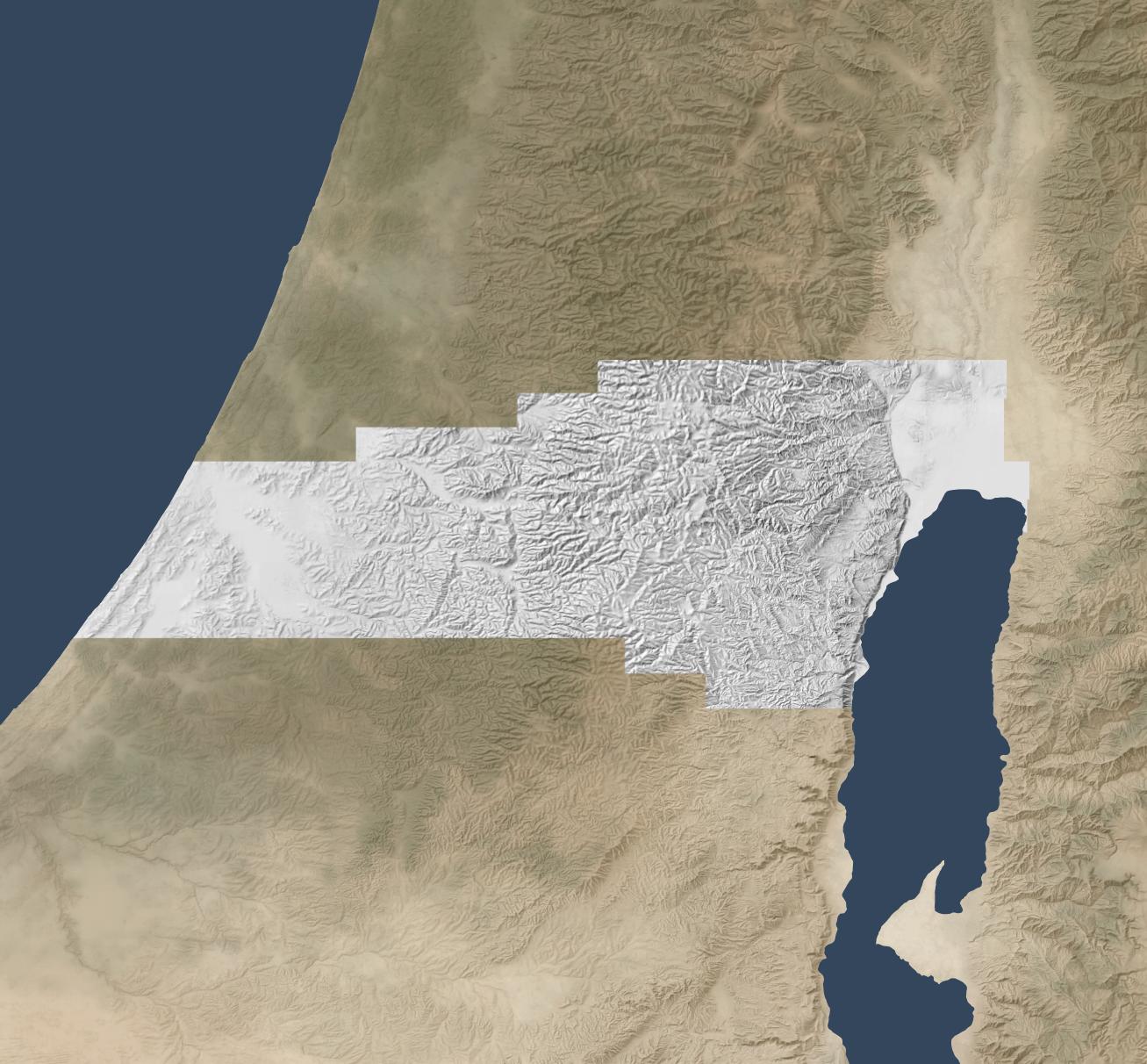
Here’s how I made the above hillshade and tiled it to cover about 3,000 square kilometers around Jerusalem.
Process
First, I used Eduard to create a 30m-per-pixel hillshade derived from the recent CC-BY-licensed GEDTM30. I gave the hillshade to Nano Banana Pro along with this prompt, repeating it a few times until I was satisfied with the result. I considered whether to go straight from the DEM to the final hillshade (which does actually work decently), but I wanted to take advantage of Eduard’s hillshading know-how. I also wasn’t confident that I could use the DEM for tiling.
Once I had an initial tile, it was mostly a matter of creating tiles that extended from existing tiles. I ran Nano Banana Pro repeatedly with this prompt, overlapping each tile by 248 pixels for a 2K tile and 496 pixels for a 4K tile (about 25 square kilometers) to ensure that the style and luminosity were consistent between tiles. Here’s an example tile overlap with high-resolution hillshade on the right and bottom sides of the tile.
I did experience some style drift, however; the hillshades got fainter over time.
This process worked great for hilly terrain; I almost never had to regenerate a tile.
For terrain with large flat areas, however, this process fell apart quickly. It often took several tries, plus adjusting the amount of overlap between tiles, to get a usable result. Typically, Nano Banana Pro wouldn’t match the luminosity of the surrounding tiles, or it would add distracting detail to the flat area. It was possible to get a decent result, but it required lots of human attention and tinkering—in other words, it wasn’t an automated process like the hilly terrain was.
If you look hard enough, you can find some tiling artifacts in flat areas (and a few in hilly areas). In practice, these tiling artifacts won’t be visible to map viewers since you’re likely draping the hillshade over some kind of background and reducing the opacity or increasing the gamma to keep the hillshade from overwhelming the viewer.
I didn’t use Photoshop on any of these tiles (though I did sometimes run a histogram match between the source tile and the result tile), but I probably would need to if I were to create more tiles for flat areas.
Results
In all, I created hillshades for about 3,000 square kilometers around Jerusalem, spending US$70 on Nano Banana Pro (2.3 cents per square kilometer, or 6 cents per square mile). That cost includes a lot of experimentation; at scale, with a mix of hilly and flat areas, the all-in cost is about 1.8 cents per square kilometer.
This area represents about 15% of the area of the full extent of ancient Israel (“Dan to Beersheba”), which means it would cost around $500 to create a full set of tiles. I stopped tiling when I exhausted my budget for this project (and my patience for regenerating flat areas).
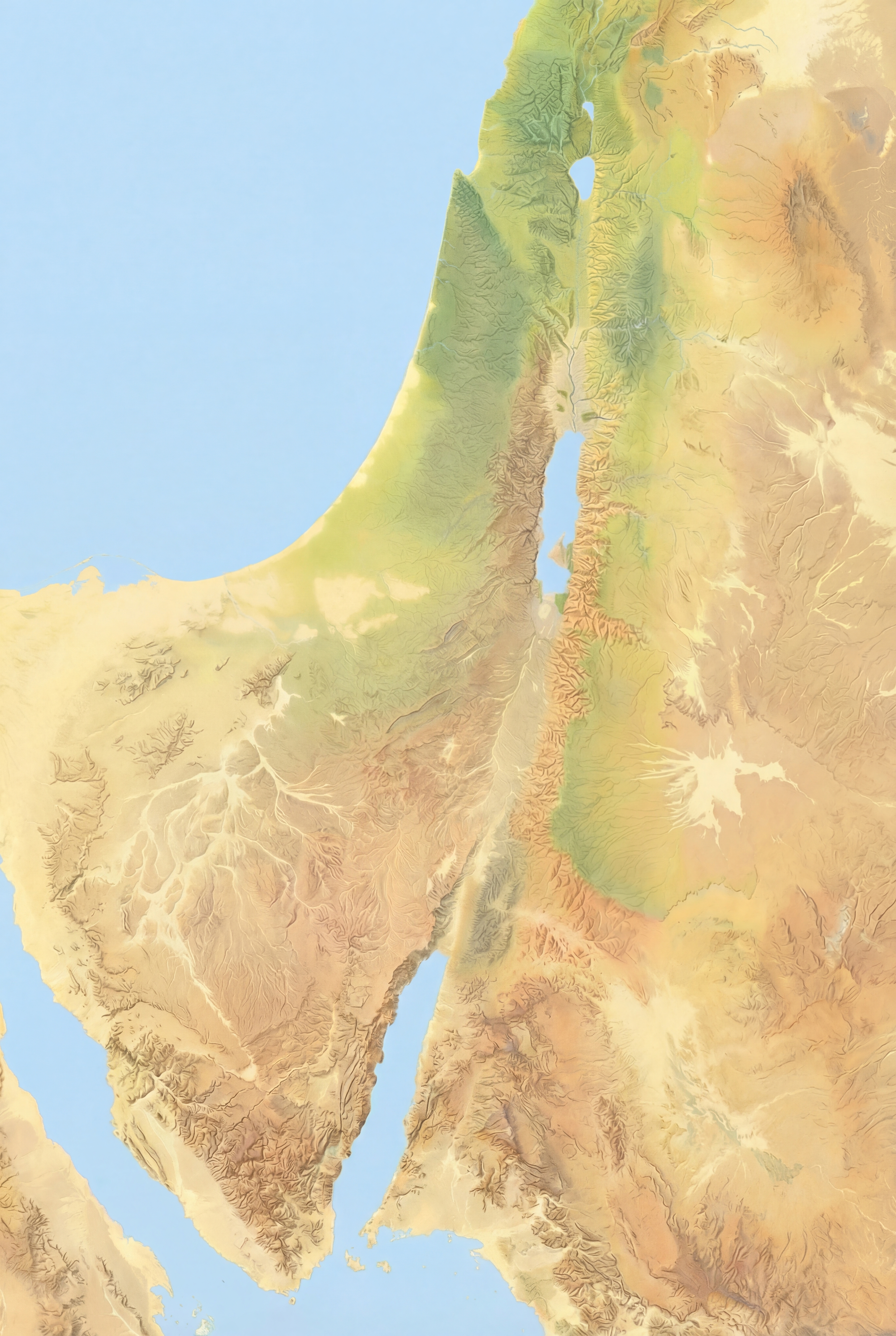
Here’s the coverage area:
Discussion
As noted above, the resulting hillshade is plausible but fake—there’s no way any process can turn a 30m hillshade into a 1.2m hillshade and reflect reality.
Whether you want to use this method depends on your application. If you’re creating a fantasy map, you’re already two steps removed from reality, so this method can add some extra realism to your map. If you’re doing historical mapping, you’re one step removed from reality, as climate, landforms, and landcover have shifted over time.
This method shines where you’re pushing past the detail available in the lower-resolution hillshade and want to provide a crisper experience without presenting all the detail that’s available in the higher-resolution hillshade. The Good Samaritan images below show where I think this method works especially well.
The hillshade quality is pretty good. In general, the results are hydrologically consistent (rivers drain in the correct direction). It also captures the traditional hillshade look exceptionally well, in my opinion, and this process scales well in hilly terrain. The limiting factor in hilly terrain is cost, whereas the limiting factor in flat terrain is the time involved to revise tiles. In flat areas, it might make sense to retain the lower-resolution hillshade or to use a different super-resolution method.
In principle, it would be possible to create a model similar to Eduard’s U-Net approach that could go from low-resolution to high-resolution hillshades without involving Nano Banana Pro. I’m skeptical that it would handle drainage properly, but the bigger barrier is that Google’s terms of service preclude creating such a model.
Conclusion
To give you a practical application, here’s a closeup of the road from Jericho (where the two roads intersect on the right) to Jerusalem (which is off-map to the left). This road reflects the setting of the Good Samaritan story. Everything on the high-resolution map feels crisper and clearer thanks to imaginary AI detail.
First the lower-resolution map:
And then the higher-resolution map:
The source 30m hillshade and derived 1.2m hillshade are both available here for your use. You’ll probably want a GIS tool like QGIS to work with them; you won’t be able to just use them as-is in Google Earth.
If you’re wondering whether Nano Banana Pro can credibly integrate a view of Roman-era Jerusalem into the rewilded landscape from the last post, the answer is yes. I appreciate how the above image even cleared some of the area around the walls, as you’d expect from history. The structures inside the city walls are mostly too large, however.
Here the rewilded landscape is misleading—during the time of Jesus (which the above image depicts), the area around Jerusalem was less forested than this image suggests. The area included agriculture, roads, pasturelands, and other changes introduced by humans.
Below is my attempt at using Nano Banana Pro to convey this human activity. It regraded the whole image slightly, and the roads aren’t exactly right. I also don’t think the Hinnom Valley south of the city would have this much agriculture. The terraced agriculture is a nice touch, though, since I spent so much time getting rid of terraces in the original image.
Here was my prompt:
Right now, this Roman-era city of Jerusalem feels pasted on, because it is. Integrate the feel of the city so that it integrates into the rest of the landscape.
Also add ancient roads and small-scale agriculture (think wheat barley, olives, and vineyards), reducing the forested area. Don’t have agriculture immediately outside the city walls. Especially include cultivated olive groves on the Mount of Olives across the gully to the east of the city.
Add a few small structures and villages in the area outside the walls (isolated farmhouses, etc.) that are appropriate for the time.
Make sure there’s a way to get into the city from the west (left) near where the walls make a “J” shape.
Keep the rest of the landscape as-is and don’t adjust the overall lighting or colors of the scene, just of the city.
Posted in AI, Geo | Comments Off on Integrating Roman-era Jerusalem into a Rewilded Landscape
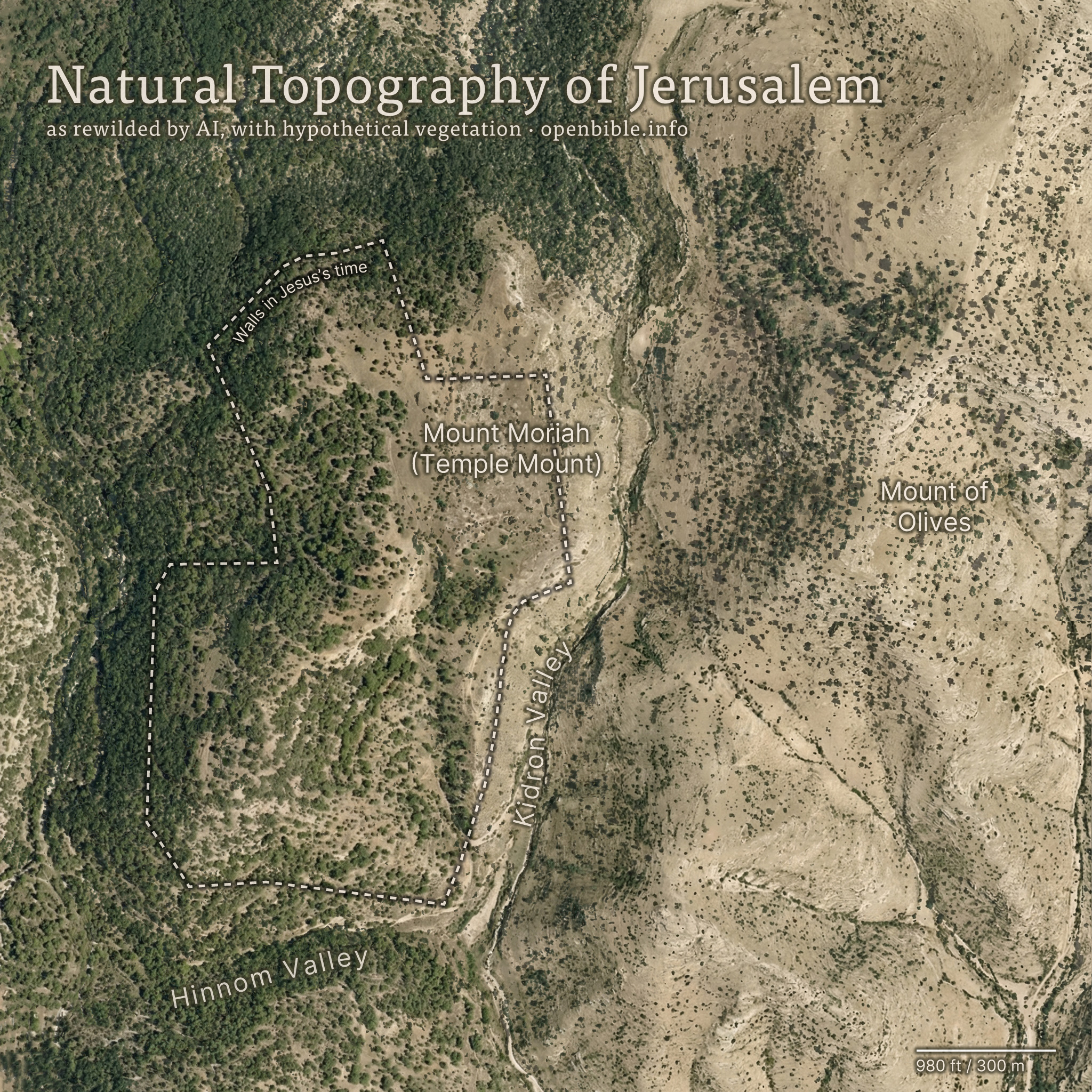
Nano Banana Pro can rewild photos of archaeological sites with AI; it can also create rewilded maps. For example, here’s a fake satellite view of the Jerusalem area with all structures, roads, and anything human-created removed:
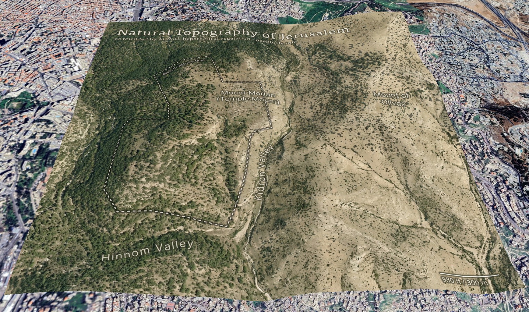
And georeferenced in Google Earth:
AI enables creating this kind of map in a few hours, rather than the weeks it would have taken using traditional methods.
The effective resolution of this image is about 1.2m per pixel, equivalent to a high-resolution (and therefore expensive) satellite photo. (A true satellite photo would show mostly urban development here, of course, and wouldn’t be terribly useful for visualizing the underlying landscape.) The topography is mostly accurate; the vegetation coverage is speculative.
Methodology
First, I needed a relatively high-resolution topography for the area around historical Jerusalem: approximately 2.3km by 2.3km (about 2 square miles). The highest-resolution free Digital Elevation Models are 30m per pixel, which at this latitude gives a grid of about 100 x 100 elevation pixels. While that may not sound like a lot, it’s enough to create a final 2,048 x 2,048-pixel image—but the low resolution of the source data also reinforces how much the AI is inventing fine surface detail.
I started with the GEDTM30 global 30m elevation dataset (which, as a DTM, aims to give bare earth elevations, excluding buildings and landcover). Using these instructions, I created 5m contour intervals in QGIS and exported them to a png. I compared these contours with 5m GovMap contours; they differed in some details but were plenty close enough for this purpose.
Here’s where Nano Banana Pro came in. I gave it the contours and the following prompt (the “text” in the prompt refers to the contour elevation labels):
This is a detailed map of the area around Jerusalem. Convert it to an overhead aerial view. Preserve all the topography exactly. Remove all text. Apply landcover (especially trees and scrub) in a naturalistic fashion and show bare dirt, light scrub, and trees where hydrologically appropriate.
Smooth out all the elevation lines—there are only smooth hills, no terraces or cliffs. Use the elevation lines as a reference, not to create terraces. No terraces should be visible at all; just smooth them out.
The idea is to make it look natural, without any human developments.
As you can tell from my pleas in the prompt, Nano Banana Pro really liked making terraces (since the contour intervals look like terraces). I ended up generating twenty-four iterations but used the seventh one because it preserved the topography of the City of David especially well. Each generation had different pluses and minuses—some were better at color, some at vegetation, and some at hydrology. That’s part of the beauty of using AI: it allows rapid iteration and many generations at low cost. This project cost about $5 in total.
I also explored giving it a version of the DTM itself (with the elevations scaled to grayscale values 25 through 244), as well as a hillshaded version. Nano Banana Pro gave me roughly comparable results for each, but I preferred how the contour versions turned out.
With a 2,048 x 2,048-pixel png in hand, it was time for Photoshop. I used the spot healing brush extensively to remove visible terraces. I also went back to Nano Banana Pro to generate trees and scrub for certain areas, brought in parts of other discarded generations, and used Photoshop’s built-in generative features in some places. You can definitely see artifacts from my editing if you look closely at the finished map. I also added an exposed rock (just visible under the “m” in “Temple” in the above map) where the Dome of the Rock now stands.
Then it was off to Illustrator to add the text and the outline of the city walls. ChatGPT gave me a few pointers to refine the look.
Finally, I georeferenced the map in Google Earth and consequently adjusted some of the wall placement in Illustrator to align the wall more precisely with structures that are still visible today.
Discussion
I’ve never used an AI + real data workflow like this one before. It would’ve been prohibitively time-consuming to create this map without AI, which is part of the ethical question around using AI. Did I “steal” the hundreds or thousands of dollars I might otherwise have paid a cartographer-artist to create this map? More realistically, I never would have created it at all.
The map’s high degree of realism could lead people to believe that it reflects reality more than it does; at first glance, you could easily take it for a real satellite photo. The landscape that it depicts never looked exactly like it does in the map. This combination of extreme realism with plausible hallucinations captures the current state of AI in a nutshell: it looks real, but it isn’t.
The map depicts a pre-human landscape (thus the “rewilding”). Biblically, it’s closest to how it might have looked in Abraham’s time, before subsequent urbanization. But even during his time, there still would be settlements, visible footpaths, grazing areas, small-scale agriculture, and potentially less forest.
Nano Banana Pro’s interpretation of the elevation data is reasonable. I feel like it made some of the eastern hills ridgier than they are in reality, however.
It also did a good job with the trees and scrub, though they’re much more speculative than the topography. I chose, artistically, to forest the western half of the map more than the eastern half, since Jerusalem approximately marks where denser vegetation in the west would yield to sparser vegetation in the east. I may have gone too far in either direction—too much forest in the west and too little vegetation in the east.
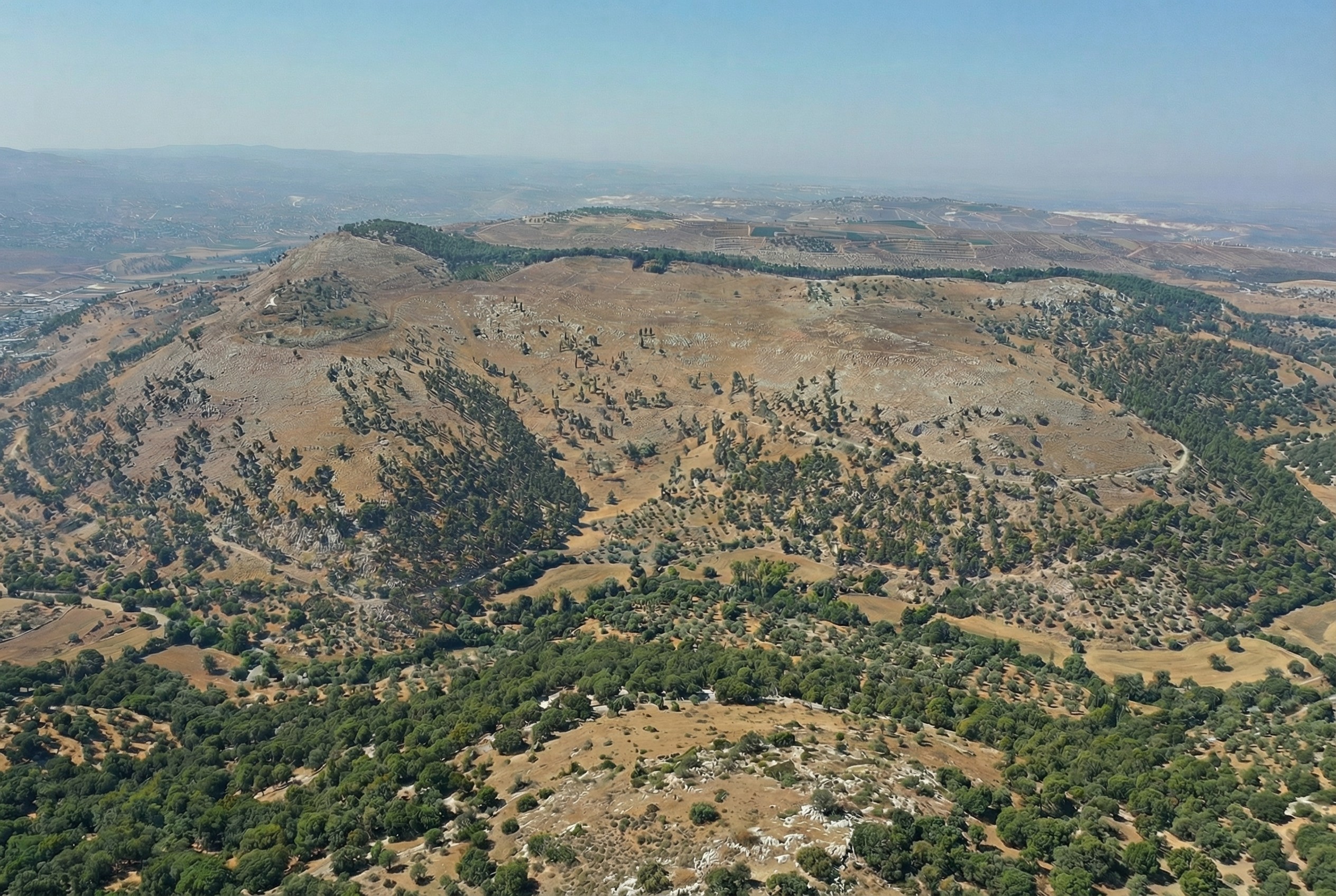
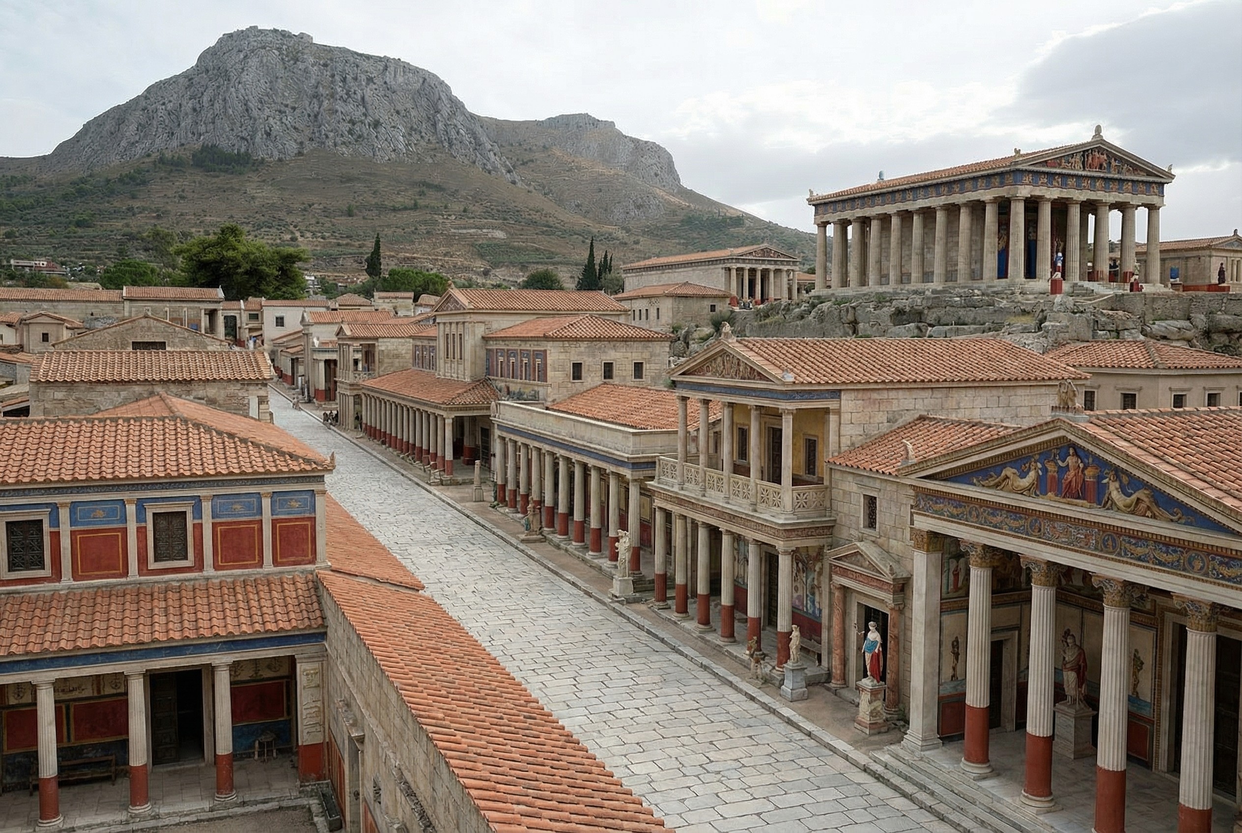
In addition to reconstructing archaeological sites from photos, Nano Banana Pro can do the opposite: it can rewild them—removing modern features to give a sense of what the natural place might have looked like in ancient times. Where reconstruction involves plausible additions to existing photos, rewilding involves plausible subtractions from them. In both cases, the AI is producing “plausible” output, not a historical reality.
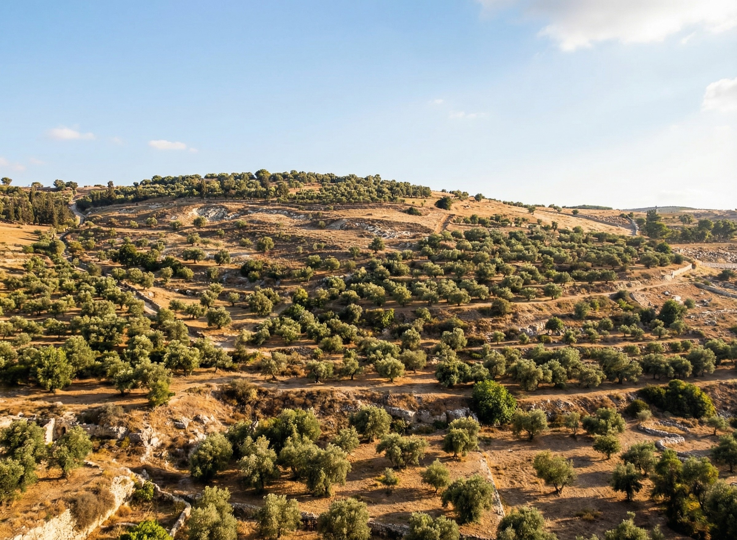
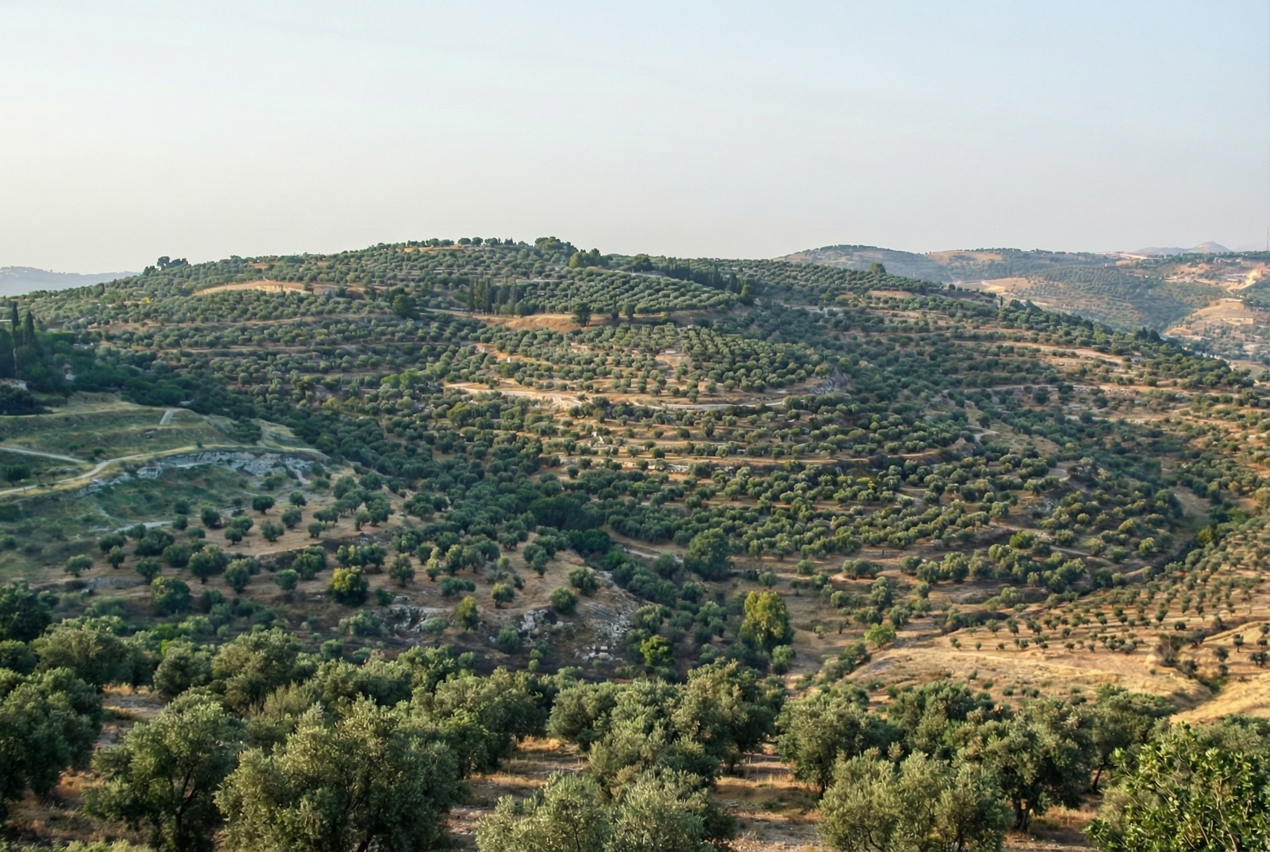
Mount of Olives
For example, the modern Mount of Olives has many human-created developments on it (roads, structures, walls, etc.). My first reaction to seeing it in person was that there were a lot fewer olive trees than I was expecting, and I wondered what it would’ve looked like 2,000 years ago.
Nano Banana Pro can edit images of the Mount of Olives to show how Jesus might have seen it, giving viewers an “artificially authentic” experience. It’s “authentic” by providing a view that removes accreted history, getting closer to how the scene may have appeared thousands of years ago. It’s “artificial” because these AI images depict a reality that never existed, combined with a level of realism that far outshines traditional illustrations. Without proper context, rewilded AI images could potentially mislead viewers into thinking that they’re “objective” photographs rather than subjective interpretations.
Rewilded Mount of Olives
The first image below is derived from a monochrome 1800s drawing of the Mount of Olives, which allowed Nano Banana Pro to add an intensely modern color grading (as though post-processed with a modern phone). The second is derived from a recent photo taken from a different vantage point.
Similarly, here’s Mount Gerizim, minus the modern city of Nablus. Nano Banana Pro didn’t completely remove everything modern, but it got close. If I were turning it into a finished piece, I’d edit the remaining modern features using Photoshop’s AI tools (at least until Google allows Nano Banana Pro to edit partial images).
This process only works if existing illustrations or photos accurately depict a location. If I owned rights to a library of photos of Bible places, I’d explore how AI could enhance some of them (with appropriate labeling), either through reconstruction or rewilding. A before/after slider interface could help viewers understand the difference between the original photos and the AI derivatives, letting them choose the view they want.
Restoration (using original or equivalent materials to restore portions of the original site) is another archaeological approach that AI could contribute to, but the methods there would be radically different.
Nano Banana Pro did its best job at converting the Mount of Olives illustration, in my opinion. I wonder if doing multiple conversions (going from a photo to an illustration and then back to a photo) could yield consistently strong results.
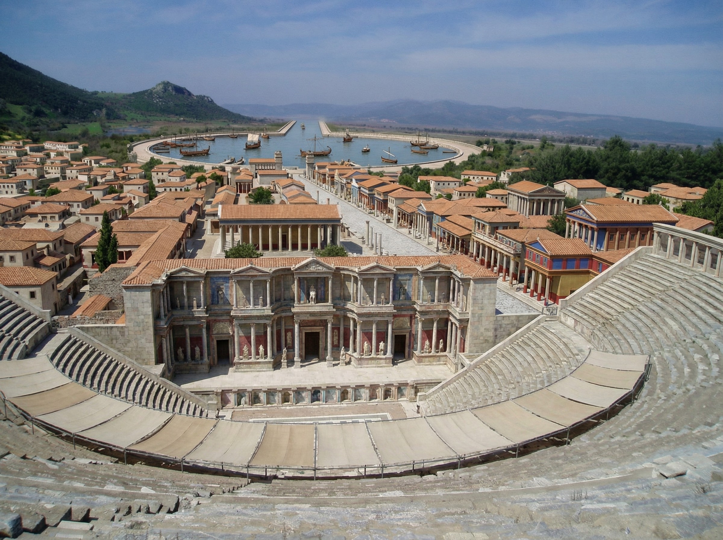
Nano Banana Pro does a plausible job of turning a real photo of an archaeological site into what the photo might have looked like if you’d taken it from the same vantage point thousands of years ago. You can imagine an app running on your future phone that lets you turn your selfies at historical sites into realtime, full-blown reconstructions (complete with changing your clothes to be historically appropriate).
Here’s a reconstructed view of Ephesus (adapted from this photo by Jordan Klein). I prompted it to add the harbor in the distance, which no longer exists in the modern photo.
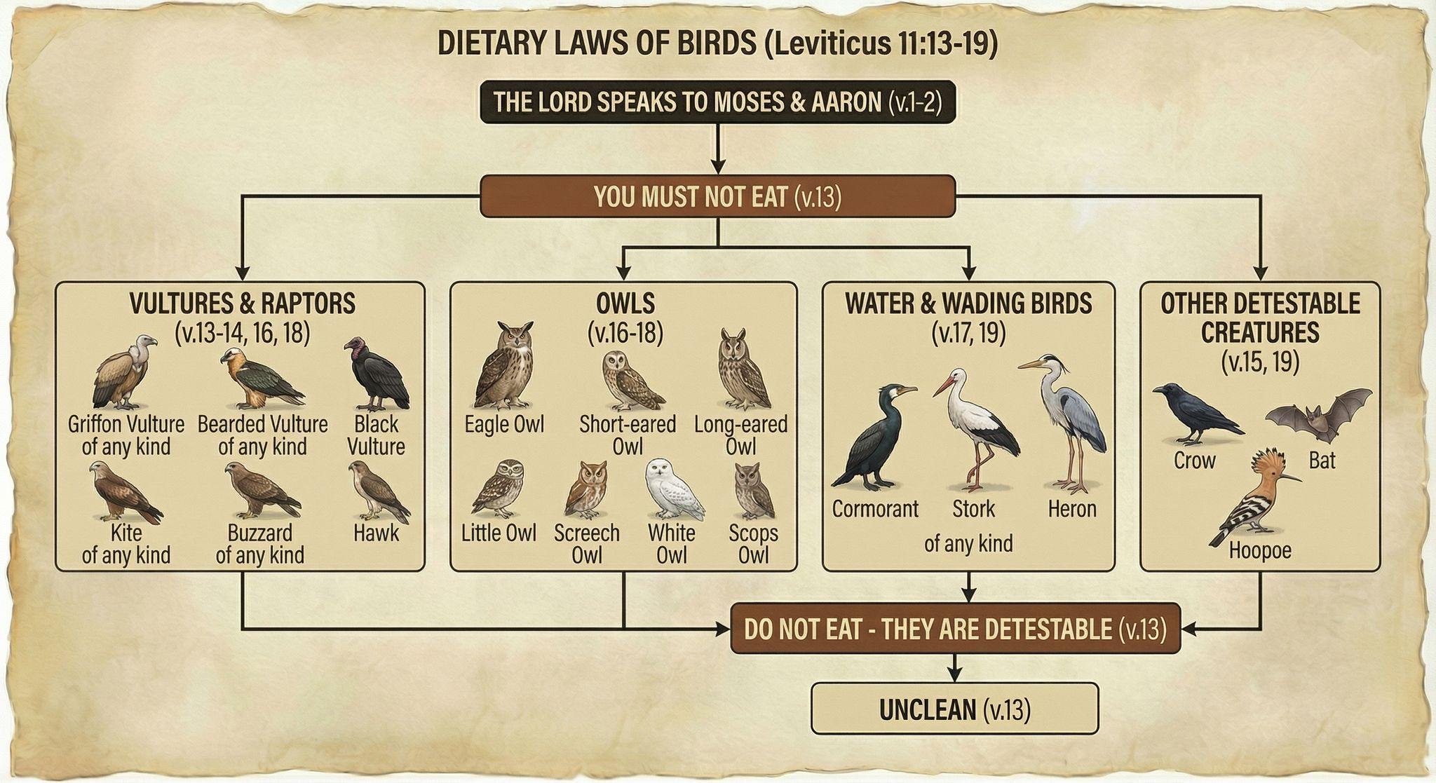
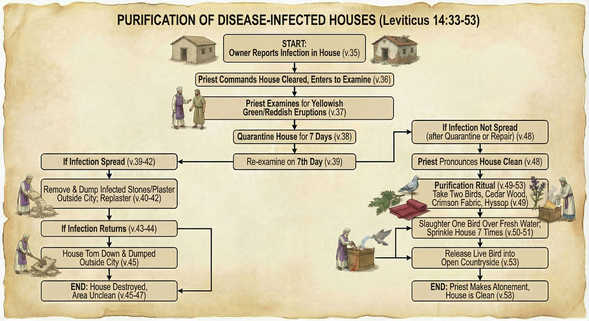
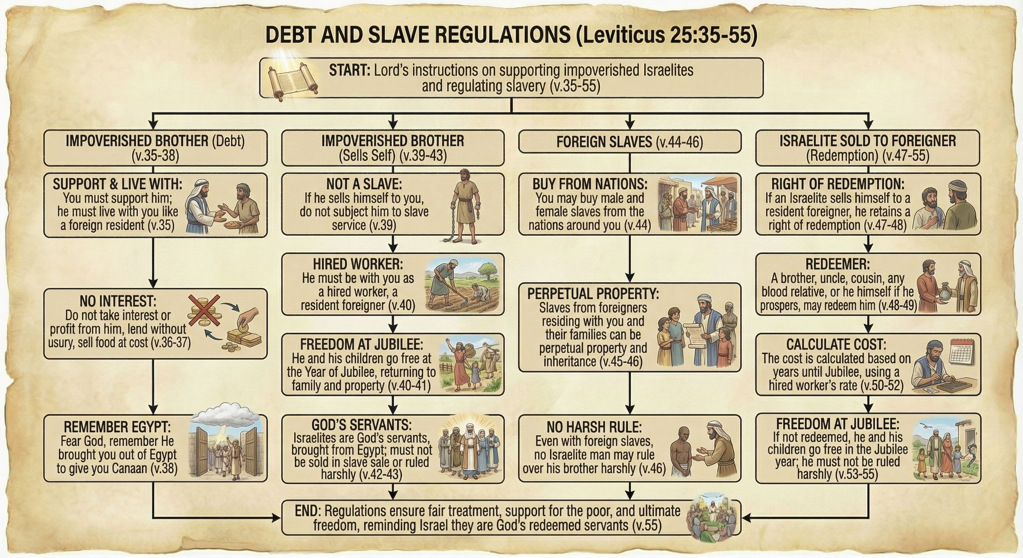
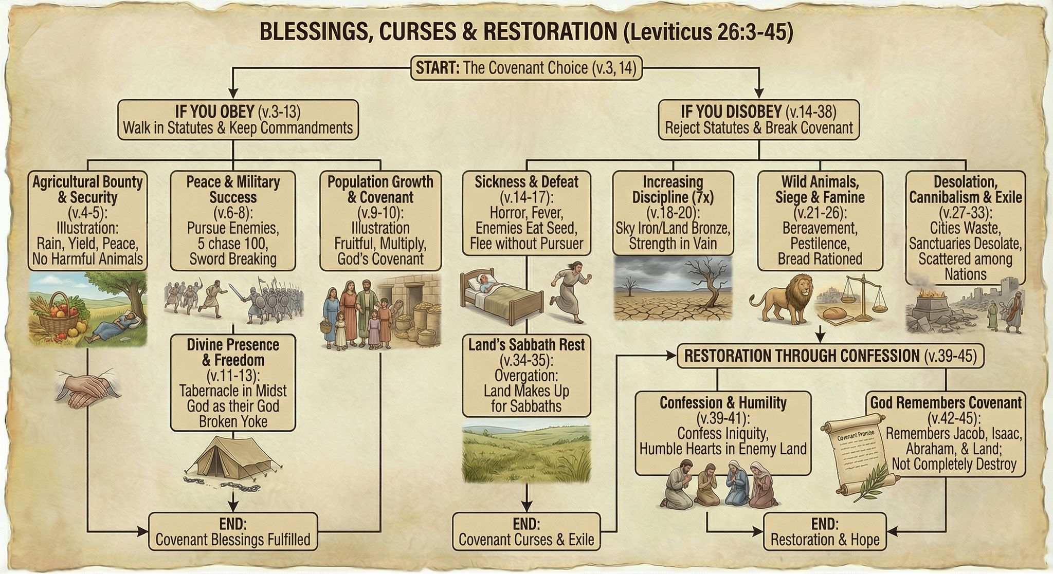
Leviticus probably isn’t your favorite book of the Bible, with its long lists of cleanliness regulations and priestly procedures. But I’ve long thought that the natural format for Leviticus is the flowchart: do this, then this, then this. A flowchart makes the prose much easier to follow. So I spent about thirty minutes a week over the past year turning Leviticus into a series of flowcharts by hand.
However, with Nano Banana Pro, I was able to make more progress in an afternoon than I had in a year—going from raw Bible text to finished flowcharts in four hours. I didn’t even use any of the work I’d done over the past year.
Here are some examples of finished flowcharts:
Methodology
I first generated some test flowcharts to get a visual style I liked. I wasn’t planning on the illustrations being so friendly, but Nano Banana Pro came up with a clear and pleasing style, so I went with it.
My first thought was to display all the Bible text—NBP could actually handle it—but the summary view I ended up with was easier to follow, visually.
From there, it was mostly a matter of choosing logical verse breaks for each flowchart, which ChatGPT helped with. I then used this prompt and gave it a previously generated flowchart as a style reference:
Create an image of a flowchart for Leviticus [chapter number] (below). Use the image as a stylistic model. Match its styles (not content or exact layout), including text, arrow, box, and imagery styles. Structure your flowchart so that it fits the content. Integrate the images into the boxes themselves where appropriate; they’re not just for decoration. Present a summary, not all the text. Indicate relevant verse numbers, and include the specific verse numbers in the title, not just the chapter number. Never depict the Lord as a person.
[Relevant Bible text]
Often it took two or more tries to get the look I wanted, or to ensure that it got all the logic right. I originally wanted to have all the clean/unclean animals on one flowchart, for example, but I couldn’t get the level of detail I was going for. So they’re broken up by animal type into multiple flowcharts.
On the other hand, even when I forgot to adjust the chapter number in my prompt, NBP would still show the correct chapter number in the output—it knew the chapter I meant, not the chapter I said.
All the image resizing and metadata work on my side to prepare the final webpage was vibecoded. It wasn’t hard code, but it was even easier just to explain to ChatGPT what I wanted to do.
Discussion
These flowcharts are better than I could have executed on my own and only took about four hours to create, from start to finish. By contrast, my earlier, manual process involved taking notes in a physical notebook, and I’d only made it to Leviticus 21 after twenty hours of work. Turning those notes into a finished product would’ve taken perhaps another 100 hours. So I got a better product for 1/30 the time investment, at a cost of $24 to generate the images.
Those twenty hours I spent with Leviticus weren’t lost, as ultimately any time spent in the Bible isn’t. In generating these flowcharts, I already had an idea of what the content needed to be and that it worked well in flowchart form.
But still, I didn’t add much value to this process. Anyone with a spare $24 could’ve done what I did. I expect that people will create custom infographics for their personal Bible studies in the future—why wouldn’t they?
The main risk here involves hallucinations. NBP sometimes misinterpreted the text, and the arrows it drew didn’t always make sense. I reviewed all the generated images to cut down on errors, but some could’ve slipped through.
As you can tell from my recentblogposts, I think that Nano Banana Pro represents a step change in AI image-generation capability. It unlocks whole new classes of endeavors that would’ve been too costly to consider in the past.
In April, I had GPT-4o create a bunch of maps of the Holy Land based on an existing public-domain map. My chief complaint at the time was that GPT-4o “falls apart on the details”—it gives the right macro features but hallucinates micro features (such as omitting specific hills and valleys and creating nonexistent rivers).
Nano Banana Pro changes that. It preserves features both big and small and doesn’t alter the location of features you give it, which means that you can hand it a map, have it transform the look, and then export it back out of Nano Banana with the correct georeferencing. You can completely change the appearance of a map and just swap it out for your purposes.
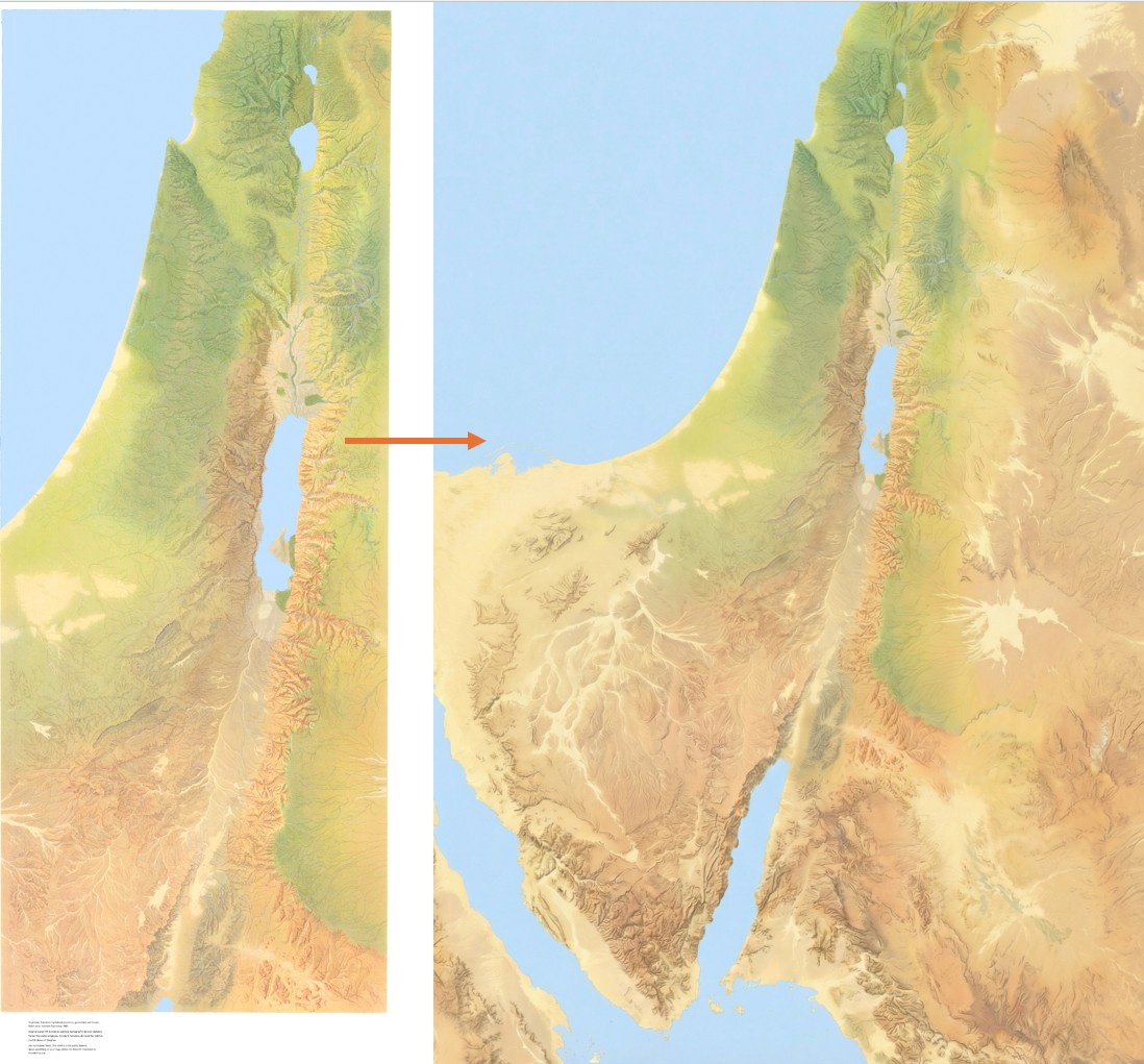
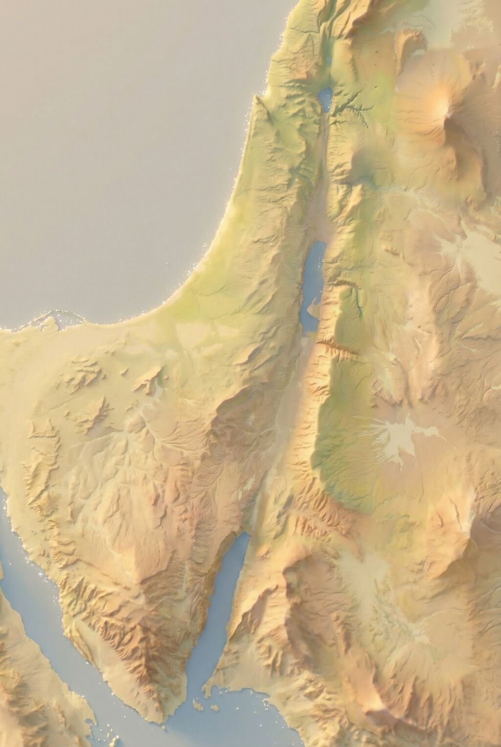
This time, I started with the same public-domain map but had Nano Banana Pro extend it so that it would have the same 2:3 aspect ratio as the GPT-4o images. It did a phenomenal job. If you’ve heard of the “jagged frontier” of AI, this work is an example of “sometimes it’s amazing.” There’s no reason why it should be so good at creating a map this accurate. But here we are. (You can download the 4K version of the generated image.)
Then I ran the same prompts on Nano Banana Pro that I used for the earlier GPT-4o images. The results preserve all the details but apply the appropriate style. While the Nano Banana Pro images are more accurate, I feel like the GPT-4o images were, on the whole, more aesthetically pleasing for the same prompt. On the other hand, the NBP images followed the prompts way better. Only a few of the more heavily stylized NBP images inserted the nonexistent river between the Red Sea and the Dead Sea.
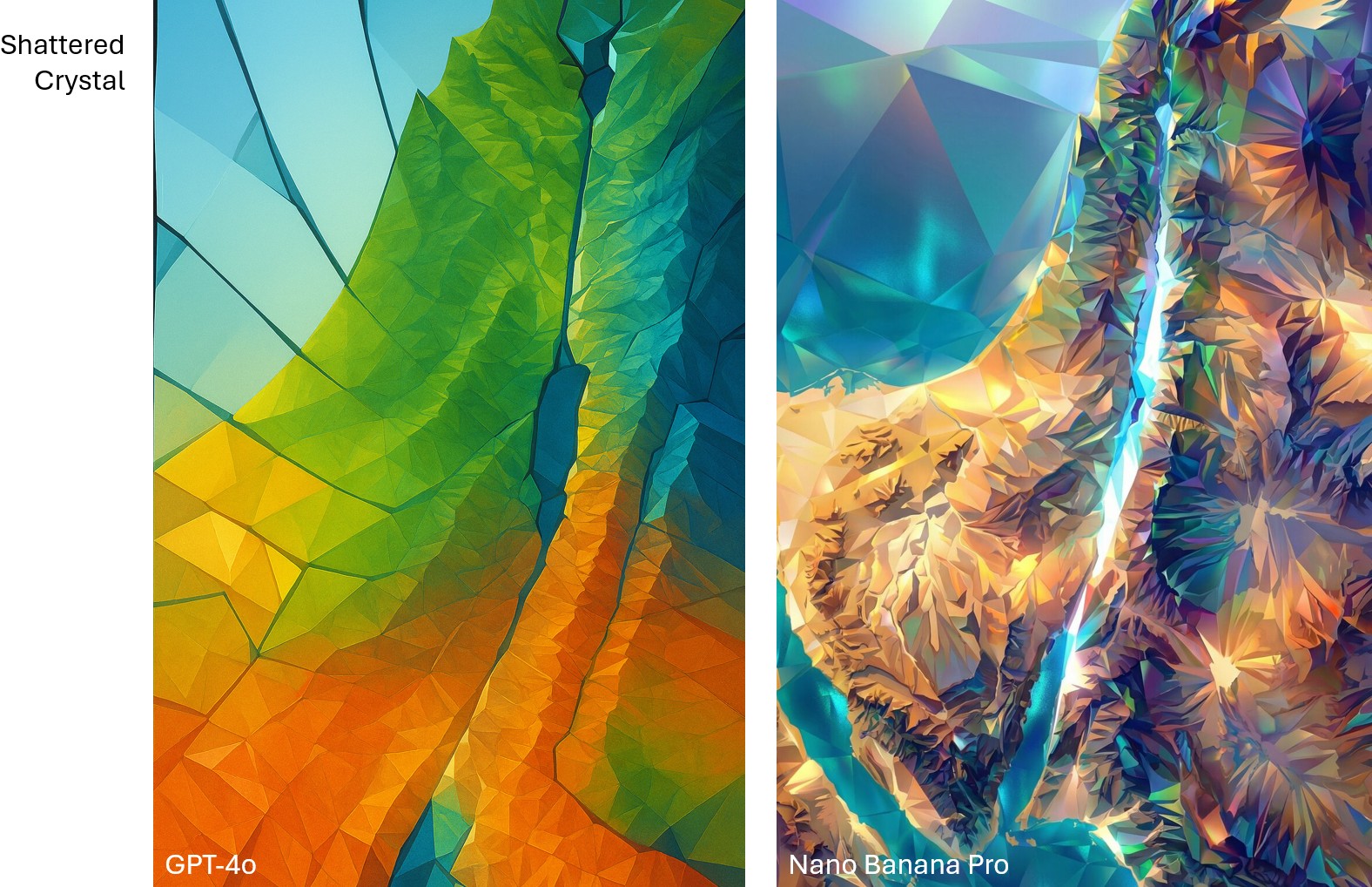
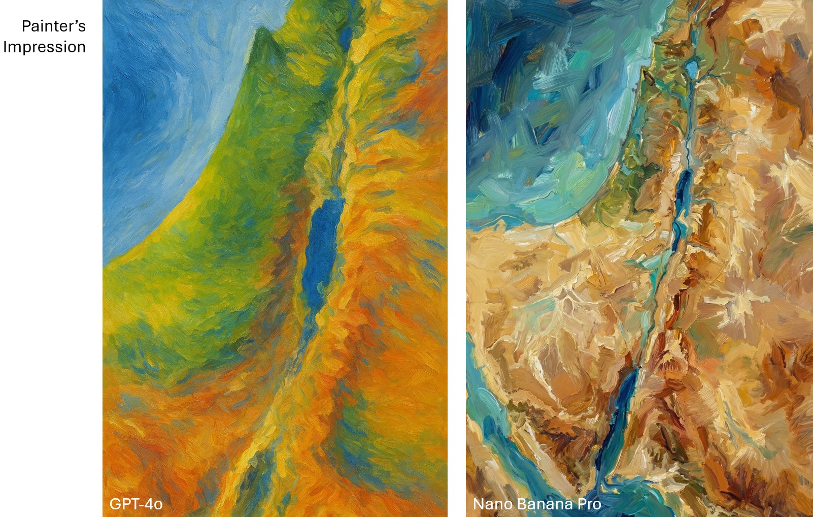
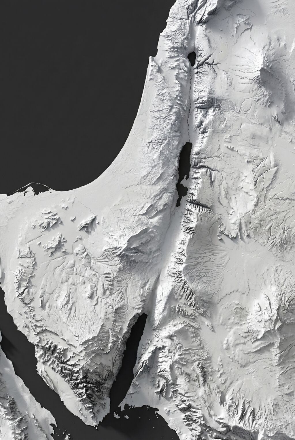
Compare the “shattered crystal” look between GPT-4o and Nano Banana Pro. GPT-4o is more conceptual, while Nano Banana Pro is more literal.Compare the “painter’s impression” look between GPT-4o and Nano Banana Pro. To my eye, the GPT-4o one captures Impressionism better.
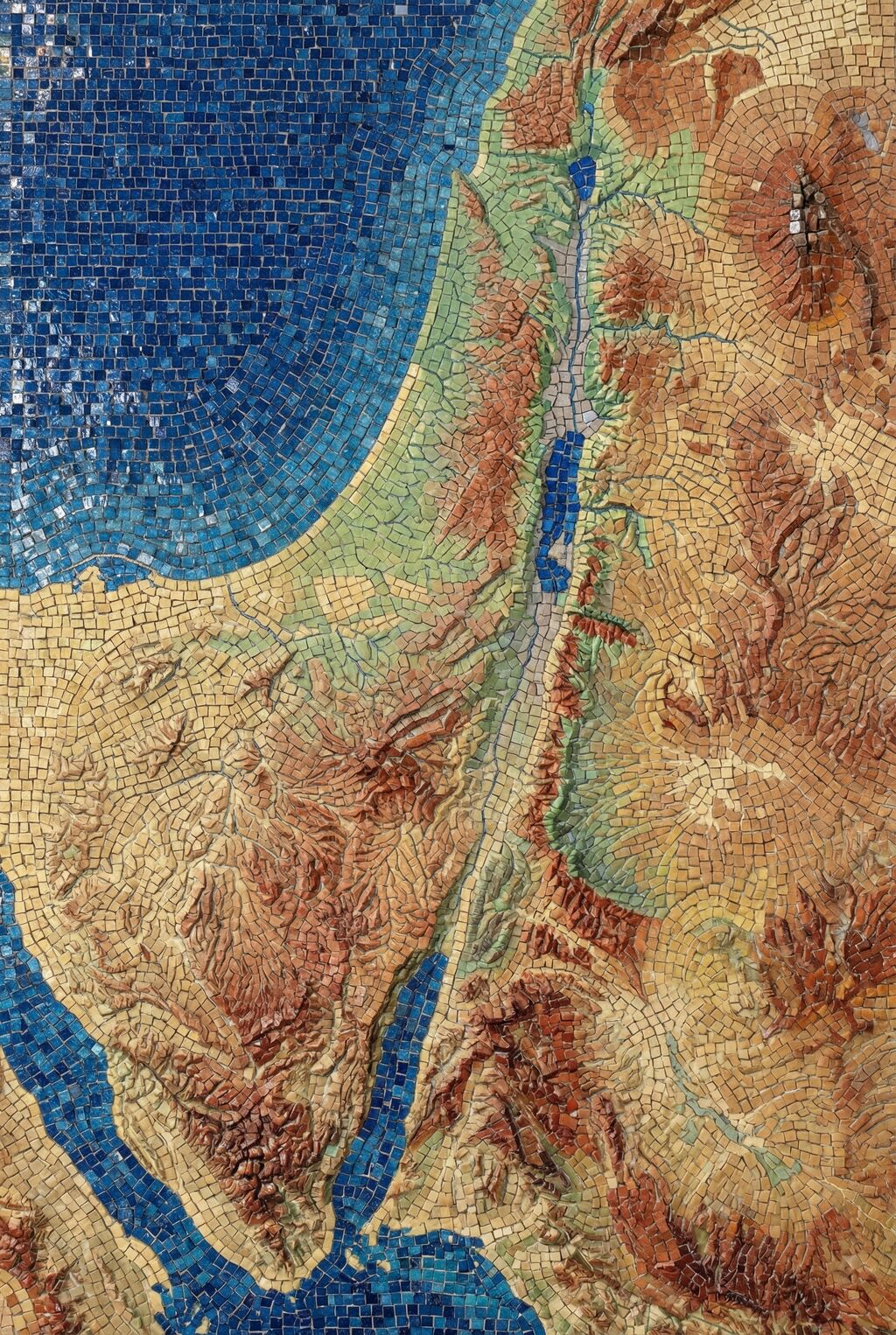
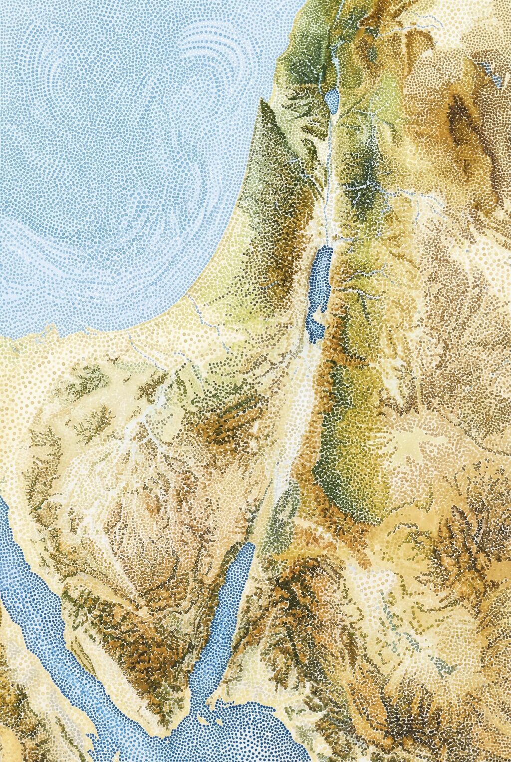
Below are some of my favorite Nano Banana Pro images. The first two recreate the Shaded Blender look that’s so hot right now. The second two show how NBP can change up the style while preserving details. I especially love how the last one makes the Mediterranean Sea feel vaguely threatening, which captures ancient Israelites’ feelings toward it.
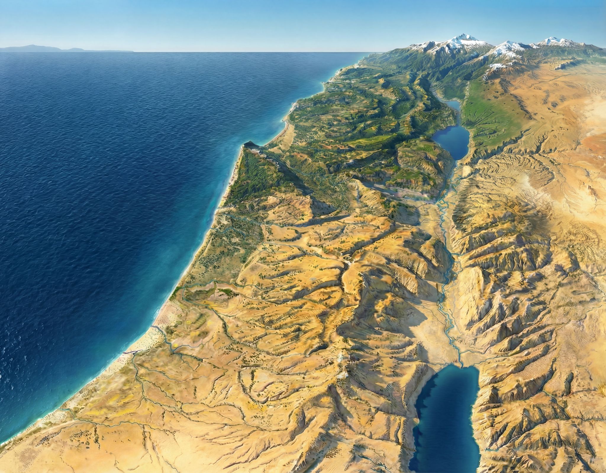
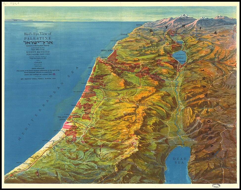
This image (made with Nano Banana Pro), recreates one of my favorite views of the Holy Land. The original (by Hugo Herrmann) dates from 1931 and is in the public domain. The use of forced perspective makes the topography of the region clear, especially the relationship of the Jordan rift valley to both the Mediterranean Sea (to the west) and the hilly terrain (to the immediate east and west). Mount Hermon in the far north makes clever use of the horizon line to show its dominance.
A view like this also illustrates why biblical writers talked about going “up” to Jerusalem (which is on the peak nearly due west from the northern end of the Dead Sea near the bottom).
The original uses an older style that’s less immediately accessible to the modern eye. Nano Banana Pro is the first AI image generator to do a good job at updating the original’s appearance while removing text and other modern features. Nano Banana Pro also preserves topographic details (which are stylized in the original and not completely accurate) amazingly well. You can tell that it’s AI-generated if you zoom in on the high-resolution version linked above, though—its details feel imprecise compared to what a human would create.
I wanted to have Nano Banana Pro draw Saul’s path from Jerusalem to Damascus using a map reference, but all its attempts were wrong in various ways. So it does have limits. But those limits probably won’t exist in six months.

.jpg)
.jpg)