Blog RSS Feed

Archive for the ‘Labs’ Category

Explore Bible Sections (Pericopes) with Sankey Diagrams

Sunday, October 6th, 2024

Explore the diagrams here.

Did you know that different translations insert section headings at different places in the Bible text? Some translations might want shorter sections to break up the text into more-easily digestible units, while others may prefer fewer sections to better preserve the flow of thought.

This project takes twenty English Bibles (BSB, ERV, ESV, ISV, NCV, CEB, CEV, CSB, GNT, GW, LEB, NABRE, NASB, NCB, NET, NIV, NKJV, NLT, NRSVue, and REB), identifies where each section starts and ends, and presents the aggregated data.

Specifically, it uses Sankey diagrams to plot section breaks for each book of the Bible. For example, here’s the diagram for Ruth (also in png format):

Pericopes for Ruth

Here’s how to read this diagram: The height of each solid bar indicates the number of translations with a heading at that verse. Lighter bands emanate from each bar to where the section ends. For example, from 1:1, you can see a small band that ends at 1:7, larger bands that end at 1:14 and 2:1, and a much-larger band that ends at 1:6. The size of the bands shows the number of translations. So we can see that most translations treat 1:1-5 as a single section, and they start a new section at 1:6. Then, starting in 1:6, there’s much more variety in how long the sections are (you can see that the bands fan out to five different vertical bars).

What can we learn from this visualization? The high bars at 1:1, 2:1, 3:1, and 4:1 indicate that translations insert headings at the chapter breaks in Ruth. (Ruth is unusual in this respect; most books don’t break so cleanly and unanimously.) In chapter one, you can see somewhat-large divisions at verses 6 (Naomi hears about God’s work) and 19 (Ruth and Naomi arrive in Bethlehem). But other translations pick different divisions in chapter 1: verse 7 (Naomi starts heading out to Bethlehem), verse 8 (Naomi asks her daughters-in-law to go back, verse 14 (Ruth clings to Naomi), verse 16 (“Where you go I will go”), and verse 18 (Naomi stops asking Ruth to go back). And still other translations don’t break up chapter one at all. So different translators see different moments as deserving headings, which shapes how you read the text.

Similarly, in chapter four, many translations see 4:13 as a turning point (when Boaz officially marries Ruth). The bar at 4:18 is showing that some translations have a heading for David’s genealogy, but most don’t.

Lamentations is another favorite. Some translations make the acrostic structure visible to the English reader through headings, but most don’t:

Pericopes for Lamentations

Is this kind of analysis helpful? I’m not really sure. And the data complexity for most books—Ruth is manageable, but longer books are less so—is perhaps pushing Sankey diagrams past where they’re useful. But explore and decide for yourself. As usual, the data is freely available to download under a CC-BY license. I used SankeyMATIC to generate the Sankey diagrams; you can click through to SankeyMATIC to interact with the diagrams by highlighting certain bands and moving things around.

See all the Sankey diagrams here.

Update: to follow on with my previous post, here are two AI-generated podcasters discussing these diagrams. The part where they discuss Exodus is especially interesting to me, since I don’t discuss it in the text. The only way they’d draw their conclusions is by looking at and understanding the Sankey diagram for Exodus, knowing that Exodus 32 is about the golden calf, and interpreting it as they do. It’s impressive. Listen here.
Read through Hebrews One Verse at a Time in 2023 with AI Help

Tuesday, December 27th, 2022

The 2023 Daily Cross Reference Bible Reading Plan (also an RSS feed) walks you through the 303 verses in the book of Hebrews one day at a time, six days a week, with a review every Saturday. It includes up to twelve of the most-popular cross references for each verse, as well as an AI-generated summary of how each cross reference relates to the main verse. Each day also contains an AI-written introduction and a concluding prayer that tie together the themes between the main verse and its cross references.

For example, one of the explanations for January 1 connects Hebrews 1:1 and Genesis 3:15 like this:

Both passages refer to God’s plan of salvation. Hebrews 1:1 refers to God’s promise of redemption through the prophets, while Genesis 3:15 refers to the promise of a Redeemer who would come to defeat Satan and restore humanity.

The quality of the content generated by the AI (GPT-3) feels generally comparable to the typical evangelical devotional; I review the generated content by hand before posting it.

In 2016, I proposed a digital-first Bible reading plan that goes through the Gospels in a year, including all the cross references for each verse. This reading plan is an implementation of this idea with an AI twist and exposes you to 2,295 different verses, or around 7% of the whole Bible.

If you’re looking for a full-year, brisk reading plan for 2023 that you haven’t done before, you might give the Daily Cross Reference Bible Reading Plan a try. You can bookmark that page, which will update itself every day, or subscribe to the RSS feed. To get a sense of what the content is like before committing, between now and January 1, the reading plan features some seasonally appropriate verses chosen by ChatGPT.

Exploring AI-Assisted Bible Study

Tuesday, August 2nd, 2022

AI-Assisted Bible Study is a new project that explores one way to apply an AI to personal Bible study, with AI-generated questions and prayers that apply to each chapter of the Bible. It helps you explore questions you might not otherwise ask, like “How have I let my livestock get in the way of my relationship with God?”

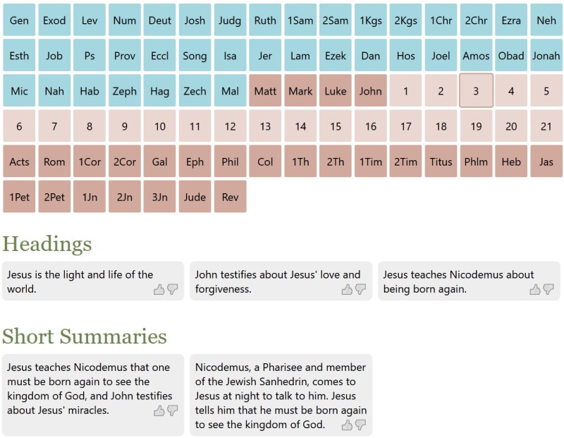
A screenshot of the tool, with books and chapters in a grid at the top followed by "Headings" and "Short Summaries" with AI-generated content.

What This Project Does

This project presents AI-generated content for each chapter of the Bible in eight categories: headings, summaries, prayers, journal prompts, and application, exegetical, observational, and discussion questions.

For example, here’s sample AI-generated content for John 3:

  • Heading: Jesus is the light and life of the world.
  • Summary: Nicodemus, a Pharisee and member of the Jewish Sanhedrin, comes to Jesus at night to talk to him. Jesus tells him that he must be born again to see the kingdom of God.
  • Prayer: Father, we pray that we would have hearts like Nicodemus, that we would be willing to learn from Jesus.
  • Journal prompt: What do you think it means that Jesus said we must be born again?
  • Application question: What does it mean that “whoever does not believe stands condemned already” in John 3:18?
  • Exegetical question: What did Nicodemus misunderstand about being born again?
  • Observation question: What did Jesus tell Nicodemus he must do in order to see the kingdom of God in John 3:3?
  • Group discussion question: What did Jesus mean when He said that He must be “lifted up”? (John 3:14)

You can vote on content you find helpful or unhelpful. (I’m particularly proud of the CSS that handles the voting, which uses emojis as interface elements and doesn’t require any images. I’m also proud of the navigation, providing fast and compact access to any chapter in the Bible.)

How It Works

I prompted GPT-3 to generate text for each chapter in the Bible in each category. For example, the prompt to generate a prayer was:

Write 5 prayers inspired by John 3 in the Bible. Remember that the events described here are in the past. First include a short observation or lesson for each prayer, and then write a personal prayer related to the lesson.

I reviewed the generated text to avoid (or at least minimize) unhelpful or heretical content. I accepted about 90% of GPT-3’s suggestions on its first pass and regenerated the rest until it gave me something useful. It cost about $150 over six weeks to generate this content, which consists of 71,062 generations and 1.1 million words.

How It Doesn’t Work

Much of the content is useful—about the level you’d find in a typical group Bible study, with interesting insights mixed with odd and irrelevant content. When the content fails, it fails in four main ways:

  1. Heretical. This is the most severe category, which I tried most to eliminate. For example: “Help me to be like Judas and have the courage to betray Jesus when the time comes” or “What would it be like to be worshipped as a god?”
  2. Wrong. This is the hardest category to edit at scale. It includes factual errors (“David is forgiven, and Bathsheba’s son is healed,” “After Paul makes his defense, Agrippa finds him not guilty, but the Jews disagree and appeal to Caesar”) but also harder-to-discern, subtler errors like “What can we learn from Nahum 2:15-16 about God’s wrath?” (Nahum 2 only has 13 verses). Since I didn’t validate every reference, I expect that this category represents the bulk of unhelpful content. The project’s voting mechanism hopefully allows the helpful content to rise to the top over time.
  3. Confusing or very specific: “David rescues his family from Soup,” “How can I identify when someone is trying to lead a rebellion against me?” or the aforementioned “How have I let my livestock get in the way of my relationship with God?” It also likes to generate prayers for historical events as though they’re ongoing: “God, we pray for our leaders, that they would have wisdom to know what to do with the Book of the Law once it is found.”
  4. Vague: “What does Amos 3 reveal to us about God’s character?” or “What are the main points of Amos 5?” This content isn’t bad; it just doesn’t apply specifically to the passage.

Future

In theory, GPT-3 could also generate on-demand answers to the questions it asks about each passage. Doing so would require giving visitors access to the AI, however, which (per OpenAI’s requirements) requires that I create a login system—not something I’m excited to do.

It could also create content at a smaller unit than a chapter (such as a verse or section). In my tests, the content it generated often proved superior to full-chapter content, but going smaller would’ve ballooned the costs of this project.

Background

In my last post about AI-generated Bible art, I mused how the text- and image-generating AIs were doing most of the creative work, and I was just copy-pasting between them. That’s true, but in a larger sense, the AIs are allowing me to explore a possibility space faster and further than I would be able to on my own. As David Holz, the founder of Midjourney (another AI-powered text-to-image generator), says:

“It’s important that we don’t think of this as an AI ‘artist.’ We think of it more like using AI to augment our imagination. It’s not necessarily about art but about imagining. We are asking, ‘what if.’ The AI sort of increases the power of our imagination.”

Thinking of AI as an “imagination augmenter” captures that it’s not “creating” in the strictest sense but rather augmenting humans, allowing them to create at a speed and scale that wouldn’t otherwise be possible individually.

Therefore, this project tries to augment your imagination in your own Bible study.

Try out AI-Assisted Bible Study.

New in Labs: Bible Translation Personas

Tuesday, September 1st, 2009

The new Bible Translation Personas experiment uses Aaron Zinman’s Personas project to scrape the web for mentions of Bible translations and then assigns a list of categories to each one, ultimately resulting in a colored strip that supposedly provides insight into the translation. As other commenters have noted, the animation process is more interesting than the result. In the case of Bibles, I’m not sure the result reveals much of interest.

Visit Bible Translation Personas

New Feature: Bible Sentence Paths

Tuesday, April 22nd, 2008

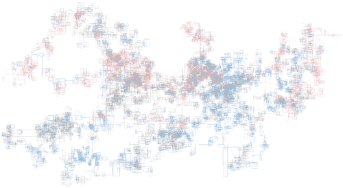
Try Bible Sentence Paths. This project maps all the words and sentences in the Bible and even sprinkles in some metadata.

Here’s what the Bible looks like when mapped in this way:
Try Sentence Paths

Background

Here’s the idea:

  1. Start facing right with the first sentence in the Bible.
  2. Count the number of words in the sentence.
  3. Get metadata for each word—is it part of a quotation? Is it a proper name?
  4. Draw a line in the current direction, one pixel per word. Color-code each pixel based on the metadata.
  5. Turn 90 degrees clockwise—if you’re facing right, face down. If you’re facing down, face left. (Etc.)
  6. Move to the next sentence.
  7. Repeat steps 2-6 until you reach the end of the Bible.

You end up with a “map” showing sentence length and metadata.

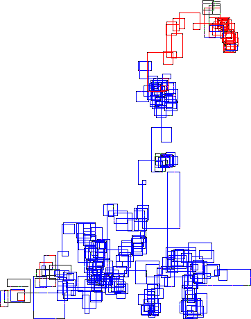
Here’s a detailed image of Job showing speeches by God sandwiching speeches by Job and others. Speeches by God are in red; everyone else’s speeches are in blue. The book starts in the lower left and ends in the upper right.

Limitations

Being able to zoom in and see the color-coded words would be a huge improvement and make this visualization more useful. I’d like to be able to hover over a specific line and read the color-coded Bible text.

Being able to browse and search the text (“Show me John 3:16”), highlighting just the relevant sections, would also be an improvement.

The drawing has lots of overlap, making it hard to draw conclusions. It’s pretty, but not too useful.

The drawing uses the ESV text as the base, since that’s what I have available; other Bible versions would probably show different patterns. It would be interesting to compare Bible versions.

Inspiration

Stefanie Posavec recently created a number of visualizations of Jack Kerouac’s On the Road, one of which inspired this project. Stefanie color-coded each sentence from the book and mapped them out a formula similar to the one I used. Needless to say, Stefanie’s visualizations are much more impressive than mine.

New Feature: Bible Verse Photo Composites

Monday, February 4th, 2008

Try Bible Verse Photo Composites. Move your mouse over the image to see a photo composite for a particular verse, and click to see composites for the words in that verse.

An example:
Genesis 1:1 shows images over the words “beginning,” “God,” “created,” “heavens,” and “earth.”

Here’s the idea: Use the Flickr API to find photos matching each of the words in the Bible. Then download the photos for each word and layer them on top of each other to produce a composite image for word. Once you do that, layer the important words from each verse on top of each other to produce a composite image for each verse.

Then put all the verses together in sequence to create the orangeish image you see above. About 300,000 images comprising 13,000 words make up the image. Each verse occupies about six pixels.

Technical Background

For layering the photos, I wanted the brightest (most-saturated) colors possible; I used a simple formula. It finds the difference between the brightest and darkest channels in a particular pixel. The brighter colors will tend have bigger differences.

function weight_pixel($pixel)
{
$rgb = array(( $pixel >> 16 ) & 0xFF, ( $pixel >> 8 ) & 0xFF, $pixel & 0xFF);
sort($rgb, SORT_NUMERIC);
return $rgb[2] - $rgb[0];
}

This formula differs from the usual conversion formula from RGB to HSL. I didn’t like the results of the RGB-HSL formula as much; the images were slightly darker.

Then I placed the darkest pixels on the bottom layer of the composite image, layering brighter (but about 50% transparent) pixels on top. The results for each word resemble abstract art:

11 (11) begrudge (begrudge) liquid (liquid) sharp (sharp) waterfalls (waterfalls)

I did a similar procedure to produce verse composites, layering the important words from each verse on top of each other. The results are generally less spectacular (in my opinion) than the word composites, as many of the verses look like each other. I’d like to explore other compositing algorithms to try to differentiate the verses more. (Feel free to leave a comment if you have any suggestions for an algorithm!)

Gen 1:2 (Gen 1:2) Josh 3:10 (Josh 3:10) Matt 5:4 (Matt 5:4)

The hardest part was the waiting. It took a long time to download the 300,000 images, and nearly as long to process them all. Plus, it takes a while to upload half a gigabyte of data after processing the images.

The verses composites omit images for about 200 common words (as listed in the Crossway Comprehensive Concordance of the ESV). I didn’t want common words to overwhelm the important ones.

From a coding standpoint, this project let me try out the jQuery Javascript library, which I’ve been wanting to do for some time.

Future Directions

Well, the result is awfully orange. As I said above, I would’ve liked to see some more differentiation. (I tried a few different formulas but didn’t come up with anything that works much better.) You can see some bands that are more orange than others, but I’m not sure how significant they are.

It would be interesting to try to calculate cross-references based on the similarity of the verse composites—are verses that look alike actually similar?

Any work of literature would lend itself to this kind of project. Project Gutenberg has lots of public-domain e-texts available. It would be interesting to compare the composite footprint of, say, Moby Dick to the Bible’s.

Inspiration

The inspiration for this project comes from the 80 Million Tiny Images project by Antonio Torralba, Rob Fergus, and William T. Freeman at MIT. They created a map of nouns in the English language by downloading images from search engines, combining the images, and then arranging them into a graphic based on the words’ semantic distance from each other. Fascinating stuff. Via ReadWriteWeb.

New Tool: Bible Word Locator

Monday, September 3rd, 2007

Try it out.

Screenshots

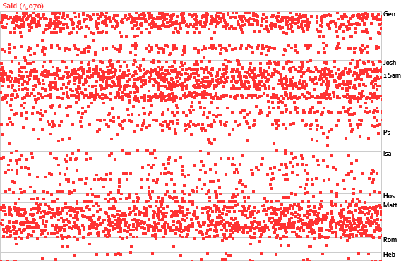
See ‘said.’
All the occurrences of the word said in the Bible. Note the narrative bands in Genesis, the Old Testament history books, and the gospels.

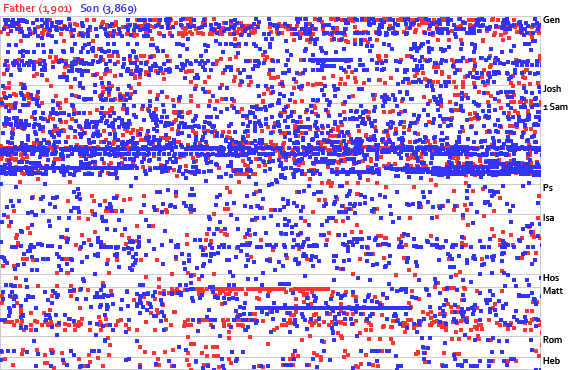
See ‘father’ and ‘son.’
Occurrences of the words father and son. Clusters in Chronicles and a couple of places in the New Testament show where to find the genealogies.

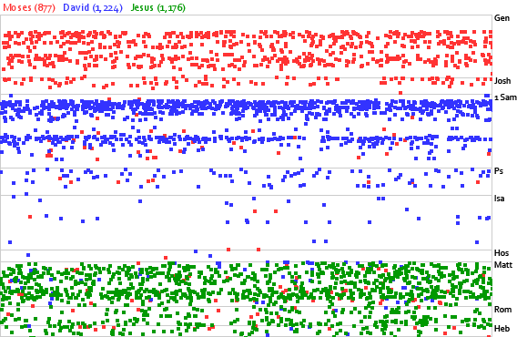
See ‘Moses,’ ‘David,’ and ‘Jesus.’
Occurrences of the words Moses, David, and Jesus. It’s easy to tell where the main stories about each person are.

Background

Part of the Similar Diversity work includes a visualization of the word you in various holy books. This visualization provided me the impetus to produce something more interactive for the Bible.

How It Works

First, I counted the number of words in the ESV Bible (767,847, including headings but excluding footnotes, if you’re interested).

Next I assigned each word in the Bible a unique, incremented number. Then it was just a matter of going through the positions and grouping them by word. The result is a database table with two columns: word (varchar(18)) and positions (mediumtext). The positions column consists of a space-separated string of numbers.

When you enter a search query, the program finds the positions of words matching your query and then plots those positions on a chart. (The chart is 1/4 the size it would be if each word position got one pixel; it would have to be 1,083×709 pixels at a one-pixel-per-word ratio.)

The Code

The code is in PHP, using the GD library. I decided this project would be a good time to try out the SQLite database that comes with PHP instead of going with MySQL. I have no complaints, though Perl creates incompatible tables with current PHP versions (5.2.4) unless you use PDO in PHP to access the tables. It worked fine after a bit of Googling revealed the workaround.

Limitations

Since the chart is 1/4 full-size, each pixel represents four words, and each dot occupies nine pixels. Given the coarse resolution, it’s best to use the locator to identify trends and then switch to the Bible text for further analysis.

It doesn’t do exact matches, only beginning-of-word matches. Only want to search for Eve, omitting results for evening? You’re out of luck.

It would be interesting to be able to click a dot and see the context of each occurrence.

Introducing Labs

Launching this tool gives me an excuse to launch the new Labs section of this site, which houses small, one-off experiments like this one and the Chapter Browser.

Experimental Interface for Browsing Chapters in the Bible

Thursday, August 23rd, 2007

Try it out. (It works best in Firefox with at least a 1000-pixel-wide screen.)

Screenshots

A grid of Bible books divided into columns and rows.
A half-size (non-interactive) image of the interface.

A closeup of the mouse cursor hovering over Psalms, with the title of Psalm 23 appearing below.
Hovering toward the left side of the Psalms shows you the title of Psalm 23.

A closeup of the mouse cursor hovering over Psalms, with the title of Psalm 121 appearing below.
Hovering toward the right of the Psalms shows you the title of Psalm 121.

Background

One challenge of developing a hierarchical Bible interface (going from books to chapters to verses) is the sheer number of options: 66 books = 1189 chapters = over 30,000 verses. Obviously you’re not going to show someone 30,000 (or even 1189) choices all at once; you need to prune the display somehow.

Often the approach taken by Bible interface designers is to divide the Bible into testaments (Old and New), then books, and finally chapters. This screenshot of the NET Bible iPhone application is typical of this approach:

The Old Testament and New Testament appear as options on the iPhone, with arrows indicating to tap to browse further in the hierarchy.
Tapping either the “Old Testament” or “New Testament” option leads to a list of books in that Testament, which leads to a list of chapters in each book, which leads to the text of the chapter. (This image comes from the blog This Lamp, where Rick Mansfield has the enviable job of reviewing Bible iPhone applications.)

One limitation with this approach is that the design has to accommodate the wide range of chapter counts in the Bible—from single-chapter books to the 150 Psalms. This variety makes certain kinds of interfaces hard to use. The NET approach above scales pretty well, though I wouldn’t look forward to all the scrolling needed to reach Psalm 150.

There’s nothing inherently wrong with this approach, however, especially if you think hierarchically. But I’m always eager to explore alternative interfaces that simplify things for at least some people.

Before I get into the specifics, I want to acknowledge an Ajaxian article on the .Mac Web Gallery as the inspiration for this interface.

How It Works

My goals with this project were:

  1. Expose the book/chapter hierarchy in the Bible without creating a deep hierarchical interface.
  2. Provide more information than simply the chapter numbers for each book.

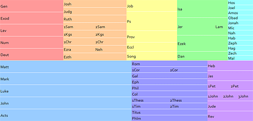
The result is a 1000×479-pixel grid. Books appear in color-coded columns based roughly on genre. Similar books (e.g., 1 and 2 Samuel) appear next to each other to minimize the vertical space required for the display.

The size of each book’s rectangle generally corresponds to the book’s length. The New Testament takes up about three times as much space as it should when compared with the Old Testament. A New Testament at the same scale as the Old would be too small to be workable. People tend to read the New Testament more than the Old, anyway, so it probably makes sense to enlarge it, though perhaps not as much as I’ve done here.

Behind the scenes, a script vertically divides each box into the number of chapters in the book. Genesis, for example, has fifty vertical slices, one for each of its fifty chapters. Hovering over one of these slices shows all the headings contained in that chapter. Moving to the left shows you the headings for the previous chapter, while moving to the right shows the headings for the next one. Clicking a slice takes you to that chapter in the ESV Bible.

This interface lets you discover a lot of information with minimal effort:

  • The order of the books in the Bible.
  • Genre groupings.
  • The rough size of each book compared with other books.
  • The number of chapters in each book.
  • The subjects of each chapter.
  • An overview of a book’s subjects if you flip through the book quickly.
  • The text of the chapter if you click.

The Code

Concerning the code and markup, the page is valid XHTML 1.0 Strict, with a preponderance of ids as hooks for the Javascript but otherwise pretty clean. The Javascript is unobtrusive, so someone without Javascript can still get to the first chapter of each book. (A page with truly accessible fallbacks would place all the chapter headings in the HTML and use a script to hide them and then show them on demand, however.) All the chapter headings appear in the code; I figured AJAX calls would be too slow to give the instant feedback the application needs.

The application uses the base2 Javascript library to iron out some of the differences between browsers. I like this library because it doesn’t do things for you the way some frameworks do, but it removes a lot of the headaches for developing cross-browser applications (attachEvent vs. addEventListener, anyone?).

Limitations

It requires some precise mouse coordination to get to a specific chapter. It’s not great for people who have poor mouse control or who are using a low-quality mouse. It might make sense to expand the horizontal area allotted to each chapter.

There’s no reason the books have to be in a grid; it would work fine if they were sequential. You could then precisely allocate the width for each book based on the number of chapters it contains.

You could show more than just the headings in the chapter—you might show the first part of the chapter, pick out a few key verses, or even attempt to show the complete text of the chapter in the popup.

I’m not crazy about all the different colors. It’s not bad for demonstration purposes, but I’d probably choose a more-restrained palette in a production environment.

It probably doesn’t work right in Opera, Safari, and IE6 and below. It also won’t work on an iPhone since iPhones don’t send the necessary JavaScript events. It probably wouldn’t work that well as-is on an iPhone anyway; it requires too much precision. Indeed, the straight hierarchical interface model might be best for an iPhone.

The URL in the status bar doesn’t change when you hover over different chapters in the same book. It’s not a big deal, but it’s irksome.

Conclusion

I hope you find the interface useful (or at least intriguing) and that it inspires you to create a Bible-browsing interface of your own. Leave a comment and a link if you do—it’s always fun to see new ways of looking at the Bible. (Creating a mockup, a low-fidelity prototype, or even just a word picture is a great way to test ideas; you don’t need to develop a full-fledged application to show off your concept.) Comments on this application are of course welcome, too.