Blog RSS Feed

Visualization: Genesis Word Trees

September 1st, 2007

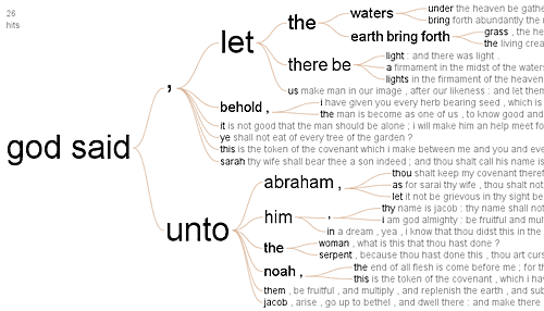
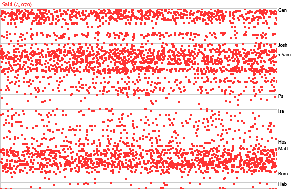
From Many Eyes (Java required), a word tree of “God said” from Genesis:

Many Eyes is a data-visualization site. They just introduced a word-tree visualization, which takes a body of text and lets you find phrases surrounding a word. One of the creators of the site uploaded this data set for Genesis (KJV). Create your own visualizations (like the one above) from this data at the site.

An interesting addition would be to let you enter more than one node. For example, entering “God” and “Abraham” would show you all the different words and phrases that connect those two words.

Visualization: Character Relationships across Religions

August 31st, 2007

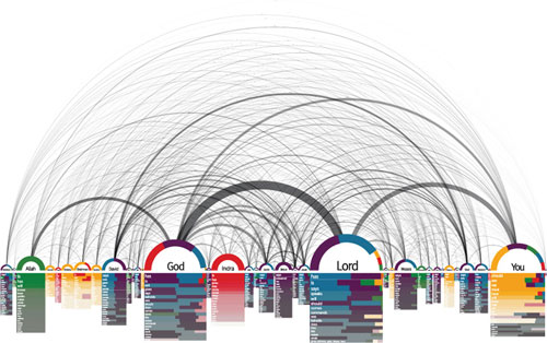
From SimilarDiversity.net:

A list of characters (‘Lord,’ ‘God’, and ‘You,’ are the most prominent) runs along the bottom, with arcs connecting them.

This visualization, by Philipp Steinweber and Andreas Koller, comes from the textual analysis of different religions’ holy books (red = Hinduism, yellow = Buddhism, green = Islam, blue = Judaism, purple = Christianity). Below each character is a list of verbs associated with him or her in each religion.

Their intent is (presumably) to show the commonalities among the different religions; I’m more interested in the technique behind the visualization itself. You could, for example, apply the technique to just the Bible and end up with a similar visualization. You could even do a similar color-coding, except with the Old and New Testaments.

Via Infosthetics, which has a few more examples of biblical visualizations in the comments. Tim Regan of Microsoft notes, “The whole area of abstract visualizations of books seems to be growing, and the bible seems to be a good testbed for these projects.”

Experimental Interface for Browsing Chapters in the Bible

August 23rd, 2007

Try it out. (It works best in Firefox with at least a 1000-pixel-wide screen.)

Screenshots

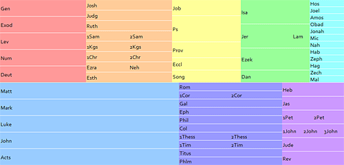
A grid of Bible books divided into columns and rows.
A half-size (non-interactive) image of the interface.

A closeup of the mouse cursor hovering over Psalms, with the title of Psalm 23 appearing below.
Hovering toward the left side of the Psalms shows you the title of Psalm 23.

A closeup of the mouse cursor hovering over Psalms, with the title of Psalm 121 appearing below.
Hovering toward the right of the Psalms shows you the title of Psalm 121.

Background

One challenge of developing a hierarchical Bible interface (going from books to chapters to verses) is the sheer number of options: 66 books = 1189 chapters = over 30,000 verses. Obviously you’re not going to show someone 30,000 (or even 1189) choices all at once; you need to prune the display somehow.

Often the approach taken by Bible interface designers is to divide the Bible into testaments (Old and New), then books, and finally chapters. This screenshot of the NET Bible iPhone application is typical of this approach:

The Old Testament and New Testament appear as options on the iPhone, with arrows indicating to tap to browse further in the hierarchy.
Tapping either the “Old Testament” or “New Testament” option leads to a list of books in that Testament, which leads to a list of chapters in each book, which leads to the text of the chapter. (This image comes from the blog This Lamp, where Rick Mansfield has the enviable job of reviewing Bible iPhone applications.)

One limitation with this approach is that the design has to accommodate the wide range of chapter counts in the Bible—from single-chapter books to the 150 Psalms. This variety makes certain kinds of interfaces hard to use. The NET approach above scales pretty well, though I wouldn’t look forward to all the scrolling needed to reach Psalm 150.

There’s nothing inherently wrong with this approach, however, especially if you think hierarchically. But I’m always eager to explore alternative interfaces that simplify things for at least some people.

Before I get into the specifics, I want to acknowledge an Ajaxian article on the .Mac Web Gallery as the inspiration for this interface.

How It Works

My goals with this project were:

  1. Expose the book/chapter hierarchy in the Bible without creating a deep hierarchical interface.
  2. Provide more information than simply the chapter numbers for each book.

The result is a 1000×479-pixel grid. Books appear in color-coded columns based roughly on genre. Similar books (e.g., 1 and 2 Samuel) appear next to each other to minimize the vertical space required for the display.

The size of each book’s rectangle generally corresponds to the book’s length. The New Testament takes up about three times as much space as it should when compared with the Old Testament. A New Testament at the same scale as the Old would be too small to be workable. People tend to read the New Testament more than the Old, anyway, so it probably makes sense to enlarge it, though perhaps not as much as I’ve done here.

Behind the scenes, a script vertically divides each box into the number of chapters in the book. Genesis, for example, has fifty vertical slices, one for each of its fifty chapters. Hovering over one of these slices shows all the headings contained in that chapter. Moving to the left shows you the headings for the previous chapter, while moving to the right shows the headings for the next one. Clicking a slice takes you to that chapter in the ESV Bible.

This interface lets you discover a lot of information with minimal effort:

  • The order of the books in the Bible.
  • Genre groupings.
  • The rough size of each book compared with other books.
  • The number of chapters in each book.
  • The subjects of each chapter.
  • An overview of a book’s subjects if you flip through the book quickly.
  • The text of the chapter if you click.

The Code

Concerning the code and markup, the page is valid XHTML 1.0 Strict, with a preponderance of ids as hooks for the Javascript but otherwise pretty clean. The Javascript is unobtrusive, so someone without Javascript can still get to the first chapter of each book. (A page with truly accessible fallbacks would place all the chapter headings in the HTML and use a script to hide them and then show them on demand, however.) All the chapter headings appear in the code; I figured AJAX calls would be too slow to give the instant feedback the application needs.

The application uses the base2 Javascript library to iron out some of the differences between browsers. I like this library because it doesn’t do things for you the way some frameworks do, but it removes a lot of the headaches for developing cross-browser applications (attachEvent vs. addEventListener, anyone?).

Limitations

It requires some precise mouse coordination to get to a specific chapter. It’s not great for people who have poor mouse control or who are using a low-quality mouse. It might make sense to expand the horizontal area allotted to each chapter.

There’s no reason the books have to be in a grid; it would work fine if they were sequential. You could then precisely allocate the width for each book based on the number of chapters it contains.

You could show more than just the headings in the chapter—you might show the first part of the chapter, pick out a few key verses, or even attempt to show the complete text of the chapter in the popup.

I’m not crazy about all the different colors. It’s not bad for demonstration purposes, but I’d probably choose a more-restrained palette in a production environment.

It probably doesn’t work right in Opera, Safari, and IE6 and below. It also won’t work on an iPhone since iPhones don’t send the necessary JavaScript events. It probably wouldn’t work that well as-is on an iPhone anyway; it requires too much precision. Indeed, the straight hierarchical interface model might be best for an iPhone.

The URL in the status bar doesn’t change when you hover over different chapters in the same book. It’s not a big deal, but it’s irksome.

Conclusion

I hope you find the interface useful (or at least intriguing) and that it inspires you to create a Bible-browsing interface of your own. Leave a comment and a link if you do—it’s always fun to see new ways of looking at the Bible. (Creating a mockup, a low-fidelity prototype, or even just a word picture is a great way to test ideas; you don’t need to develop a full-fledged application to show off your concept.) Comments on this application are of course welcome, too.

Indexing English Place Names to the Original Languages

August 19th, 2007

Jason asks whether it’s possible to index the English geocoded place names to their original Greek and Hebrew equivalents via Strong’s numbers:

I’m the developer for dynamicbible.com and i’ve been planning to integrate geocoded places into the app for a while. I ran across your kml, and though its really useful the way it is now, i was wondering if you had considered adding strongs number to the entries.

The reason i suggest it is, having that number would provide an easy way to distingish between identically named places and would also provide a very fast way to index and cross reference those coords with other xml bible documents. I’m having to run a script that matches the entries by word, but differences in spelling, spacing, and special symbols makes that kind of match a little inaccurate, or at least incomplete.

Answer: I can’t think of a good way to do something like this automatically. To do it accurately, you’d have to have programmatic access to an ESV-Strong’s alignment (since the ESV was the starting point for the geocoding work). The ESV Reverse Interlinear New Testament from Logos has Strong’s numbers, but the Old Testament equivalent doesn’t. And even if it did, I’m not sure how to extract the Strong’s numbers programmatically—or even whether it would be legal to do so. (Probably not.)

Straight string-matching with the KJV text gets you 717 of the 1176 distinct ESV names, or 61%. You might be able to statistically interpolate some of the rest by looking at Greek and Hebrew words that appear in every verse where the name occurs. Unless Crossway releases a Strong’s alignment through their API, however, you’re probably stuck with doing manual work to create an ESV-Strong’s place-name alignment.

If you want to produce one, of course, go for it. Any readers with suggestions about how to create this kind of alignment should feel free to speak up in the comments. (Hey, it never hurts to appeal to the lazyweb, no matter how obscure the request.)

Bethlehemites Live in Bethlehem

July 14th, 2007

And Kenizzites (singular Kenizzite) are the descendants of Kenaz.

I wasn’t able to find a list that lines up the noun (Assyria) and adjective (Assyrian) forms of biblical people and places, so I made one. Download the complete list in tab-delimited format.

There are about 270 lines covering about 340 distinct word forms. The list covers all the adjective (singular) and demonym (gentilic or plural) forms that appear in the ESV Bible.

The fourth column in the file indicates whether the noun is a person, place, or something else. The category wasn’t always clear-cut, given that many place names started as people names. There wasn’t always a noun equivalent (Pharisee, for example, lacks one).

This file should assist computer programs, allowing them to map variants back onto their noun bases without having to jump through linguistic hoops.

Topical Bible Technical Notes

July 2nd, 2007

As promised, here’s how the new Topical Bible works.

The Goal

The goal was to create a new topical Bible (TB) that takes advantage of the vast array of data on the Internet, warts and all.

Seeding the Topics

I wanted the TB to reflect what people really want to know, not what a human editor thinks people want to (or should) know. (I have no problem with human editors, but the point of the TB is to see what the results are when you forego them.) That meant populating the TB with actual queries. But where to get them? The options:

  1. Start with a few topics hand-selected by me based on research and intuition. The problem is that the number of topics would be small (probably less than 100). That number would (hopefully) increase over time, but it would grow erratically and might not attract enough people to the TB to make it useful. Further, the wording of the topics would reflect my biases.
  2. Start with the topics from a public-domain Nave’s Topical Bible. The main problem is that a lot of the “topics” are obscure, often just names of biblical people. Further, English has changed in the 100 years since Nave published his TB; how many people search for Bible verses about abstemiousness? So I’d either have to clean up the topics or live with a lot of irrelevant topics.
  3. Ask for permission to license a topic list from the publisher of a newer TB or from another TB website. They might be willing to share their list. But again, the problem is that the topics wouldn’t reflect what people really want to know about.
  4. Use a search engine API to generate the topics.

In the end, I combined the Yahoo Related Suggestion API and Firefox’s auto-complete feature (completing the phrase “What does the Bible say about…”) to create a list of about 4,000 topics.

Some of the resulting topics had typos, so I ran them all through the Yahoo Spelling Suggestion API, which turned up 176 misspelled topics (and a few misses—no, I really did mean “caring for widows,” not “caring for windows”).

Getting Related Verses

The next step was to get the verses. I used the Yahoo Web Search API to get the top thirty webpages related to each topic and then extracted the verse references from each page.

Daniel Foster from Logos rightly points out that extracting Bible verses from webpages is “fraught with perils.” Thankfully, it doesn’t have to be perfect; it just has to be good enough.

The ESV folks have published the Bible-book abbreviation list they use on their site. I started with the abbreviations in that file, then built up regular expressions to find only fairly definite Bible references. (For example, references to some person named Matt shouldn’t match a Bible reference.)

I stripped the HTML from the webpage and did some more normalizing, then went through each of the abbreviations (the actual code is a little more complex, but you get the idea):

my $ref = '\d{1,3}(?:[.:]\d{1,3})?(?:\s?[\&\-]\s?\d{1,3}(?:[.:]\d{1,3})?)?[ab]?'; #chapter/verse references
my $verse = "$ref(?:\\s?[,;]\\s?(?:$ref))*"; #multiple verse references
foreach my $abbrev (@abbrevs)
{
my $regex = "\\b$abbrev\\.? ?$verse\\b"; #go through each abbreviation
while (/$regex/) {…}
}

Next I figured out exactly which verses each reference refers to. For example, the string “Genesis 1,2” really means “Genesis 1:1-31 and Genesis 2:1-25.” The ESV API’s getQueryInfo method figures out everything for me. Why should I write a bunch of reference-parsing code when someone’s done all the hard work?

So I did an ESV API query for each reference, caching the results so identical references in the future don’t require an API lookup.

Collating the Verses

Once I retrieved all the verses for a topic, it was just a matter of looking for patterns among all the webpages. The algorithm was pretty simple: each page got one vote per unique verse—so two references to John 1:1 on the same page would only count as one vote. All verses that appeared on two or more webpages made it into the main TB index.

Sweetening the Relevance

In the end, I was able to use some of the topics from Nave’s work. About 750 of the topics occurred in both the new TB and in Nave’s; every verse for each topic in Nave’s got an extra three votes in the new TB. So, for example, 1 Corinthians 15:45 originally had eight votes under the topic of Adam. The mention in Nave’s added another three votes, bringing the vote total to eleven votes (to start with).

Displaying the Bible Verses

I use the ESV API to display the Bible verses, with heavy caching. Only five verses appear when the reference is to an extended passage, though the link points to the complete passage on the ESV site.

A recent addition to the UI is a “related topics” link—a reverse TB that lets you see the all the topics for a given verse in tag-cloud format. Entering a verse reference into the search box takes you to the same page. For example, here are all the topics for Galatians 5:13.

Ongoing Topics

The site follows a simplified version of the above procedure for new words: anytime someone searches for a word that doesn’t exist, the site goes out and finds relevant pages, parses them, and displays the results.

I originally wrote a nice multithreaded Perl script to fetch new topics quickly, but Dreamhost (my hosting company) kills it when it runs, so now everything happens serially—thus slowly.

Weaknesses

It works pretty well for popular topics. My favorite user-created topic is Christian Hedonism, a phrase popularized by John Piper; the TB did particularly well for this topic.

It doesn’t work so well for obscure topics or topics about which the Bible doesn’t really have anything directly relevant. More sophisticated algorithms might be able to correct this deficiency to an extent, but I’m not sure what form those algorithms would take.

Daniel from Logos rightly points out that the TB should really be “What people say the Bible says about….” I find some of the verses chosen for topics personally offensive. Do you really want to tell people with eating disorders that the weak person eats only vegetables, and not to judge them if they abstain from eating?

The main danger is in taking verses out of context; I’m afraid that someone will read a verse and act on it without considering what the verse means in context.

Results

Since launching three weeks ago, people have voted up or down 3,000 verses and suggested 200 new verses, in addition to creating 500 new topics.

Why?

The recent book Everything Is Miscellaneous inspired the TB. The book has a number of implications for Bible study; I may blog about it in the future. I wanted to apply some of the book’s ideas to the Bible, and the TB seemed like an easy way to do it.

In all, it took about three weekends of part-time work to create, somewhat less than the fourteen years Orville Nave spent on his famous TB. Collecting the data was the easy part; coding the frontend took several days.

The Future

Daniel from Logos has a few suggestions about letting people tie together topics instead of creating new ones for each query. I can (and do) edit the database to reduce some of the redundancy. I’ve given some thought about the UI and backend for such a system and how to prevent people from manipulating it, but an implementation remains in the future. I’d also like to spell-check new topics and let people correct the spelling instead of automatically creating the topics.

It would be helpful for people to be able to tag verses with topics when looking at a verse’s tag cloud. The main issue is how to flow the topics back into the topical index.

I’m also not entirely satisfied with how you have to know the exact verse reference to suggest a verse for a topic. Ideally, you’d also be able to enter a few keywords and get back relevant verses.

Overall, however, the TB has performed well so far.

New Feature: Topical Bible

June 9th, 2007

It’s really more of a web 2.0 topical Bible mashup. Some popular topics: marriage, divorce, gambling, dating, Harry Potter. (Try finding Harry Potter in your Nave’s Topical Bible.)

The topical Bible combines the Yahoo! and ESV Bible web services to identify topics and find relevant verses. It currently has about 4,000 topics. Searching for a topic that doesn’t exist will automatically add it to the topical Bible, which will then scour the Internet for relevant verses.

You can vote on whether the listed verses are relevant to the topic—or you can suggest new verses. Over time, the topical Bible should become better at identifying what people think the Bible says about a topic.

More technical details will follow, but I wanted to post it and let you try it out. It’s still a work-in-progress, but what isn’t these days?

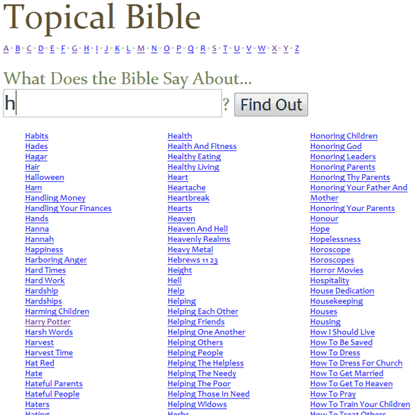
Here’s a screenshot:

Visit the topical Bible

Bible Microformats

May 26th, 2007

Sean from Blogos proposes a microformat for marking up Bible references on the web.

About Microformats

Microformats are a way of marking up semantic data in HTML without inventing new elements or attributes. For example, here’s how you might mark up geographic coordinates:

<div class="geo">GEO: <span class="latitude">37.386013</span>, <span class="longitude">-122.082932</span></div>

In this way, computer programs can figure out without any ambiguity that the above sequence of numbers refers to latitude and longitude. Browsers, for example, might automatically link the coordinates to Google Maps or your mapping application of choice. Firefox 3 is evolving along these lines.

Bible Microformat

I’ve been thinking for a while about the best syntax to use for a Bible microformat. The problem I kept running into was in coming up with the One True Representation of a Bible verse (i.e., is it “John 3:16” or “Jn 3:16” or “John.3.16” or something else).

Sean neatly sidesteps the problem with a “good enough” solution. He proposes a format akin to the following:

<abbr class="bibleref" title="John 3:16">Jn 3:16</abbr>

The crucial aspect is that it doesn’t matter exactly how you specify the Bible verse—once you do the hard part of indicating that a string of text is a verse reference (the class="bibleref"), any decent reference parser should be able to figure out which verses you mean. It’s so simple it’s brilliant.

Now let’s push it a little further.

I suggest that the microformat should take advantage of the underused and, in this case, semantically more meaningful <cite> tag rather than the <abbr> tag. You are, after all, citing the Bible.

<cite class="bibleref">John 3:16</cite>

However, you also have to account for people who link the verse to their favorite online Bible. You could double-up the tags:

<a href="…"><cite class="bibleref">John 3:16</cite></a>

But it’s messier than need be. Since the practice of linking is widespread, why not overload the <a> tag with the appropriate class:

<a href="…" class="bibleref">John 3:16</a>

Both <cite> and <a> have a title attribute in which you can place a human- (and machine-) readable version of the verse if you choose. The title is optional as long as the verse reference is the only text inside the tag. Indeed, a title is required only if the element’s text is ambiguous (a verse without a chapter and book, for example, or completely unrelated text). (The practice of not recording duplicate information is the Don’t Repeat Yourself principle.) For example:

<p>God <a href="…" class="bibleref" title="John 3:16">loves</a> us.</p>

Corner Cases

So how would you specify a Bible translation if a specific translation were germane to the citation’s context? (In theory, when you don’t specify a translation, people consuming the microformat could choose to see the passage in the translation of their choice, similar to how some people prefer to look up an address in Google Maps, while others prefer Yahoo Maps.) I’m sympathetic to the OSIS practice of indicating the translation first, followed by the reference. For example:

<cite class="bibleref" title="ESV: John 3:16">Jn 3:16</cite>

This practice follows the logical progression of going from general to specific:

[Implied Language] → Translation → Book → Chapter → Verse

The title is also human-readable, though it departs from the standard practice of placing the translation identifier after the reference.

Sean mentions two other cases of note: verse ranges (e.g., “John 3:16-17”) and compound verses (e.g., “John 3:16, 18, 20”). Personally, I see no reason for a biblerefrange attribute as he suggests. A bible reference parser should be able to handle a continuous range as easily as a single verse.

But compound verses present a more complex problem. How do you mark them up? The above examples all stand on their own, which is one of the principles of microformats—you parse the element and get everything you need. But let’s say you have the text “John 3:16, 18.” Treating the range as a unit is easy:

<cite class="bibleref">John 3:16, 18</cite>

Any parser will handle that text; though it could be ambiguous (do you mean John 3:16 and John 18?), in practice it rarely is. But what if you mark them up separately?

<cite class="bibleref">John 3:16<cite>, <cite class="bibleref">18</cite>

In this case, the “18” doesn’t communicate enough information to the parser. The parser could maintain a state and know that the previous reference was to John 3:16, but state requirements increase the parser’s complexity, which in turn defeats the purpose of the microformat in the first place. In such cases, then, I would argue that a title attribute is necessary:

<cite class="bibleref">John 3:16<cite>, <cite class="bibleref" title="John 3:18">18</cite>

Putting It All Together

Here’s my Bible microformat proposal:

Citing a Bible Verse without Linking to It

<cite class="bibleref">[reference]</cite>

Citing a Bible Verse while Linking to It

<a class="bibleref">[reference]</a>

Citing a Bible Verse Indirectly (or When the Text Is Ambiguous) without Linking to It

<cite class="bibleref" title="[reference]">[any text]</cite>

Citing a Bible Verse Indirectly (or When the Link Text Is Ambiguous) while Linking to It

<a class="bibleref" title="[reference]">[any text]</a>

Verse Reference Format

The [reference] in the above examples refers to a machine-parsable and human-readable representation of a single verse, a range of verses, or a series of verses. You should use unambiguous abbreviations if you use abbreviations. See Appendix C in the OSIS spec (pdf) for a list of possible abbreviations.

When you’re in doubt about whether the reference text is parsable, use the title attribute to encode a fuller representation. In particular, when the reference doesn’t include all the text necessary to produce an unambiguous book/chapter/verse reference, place an unambiguous reference in title.

About the title Attribute

The title attribute, when present, takes precedence over the contents of the element (<cite> or <a>). When the title is not present, the contents of the element are assumed to be the verse reference. The title attribute contains an unambiguous machine-parsable representation of the verse reference.

The attribute can also contain an optional translation identifier at the beginning of the value, followed by a colon. Appendix D in the OSIS spec (pdf) has a list of translation identifiers. For example:

<cite title="ESV: John 3:16">…</cite>

To be comprehensive, you would ideally include a language identifier (e.g., “en:ESV: John 3:16”) before the translation identifier. I would argue that a language identifier is only necessary if you’re using a non-standard abbreviation.

However, you should only include a translation identifier if it is important that your readers see a particular translation or language. Otherwise, you should allow the parsing software to use your readers’ preferred translation and language.

Here is a Perl regex for allowed formats in the title. $1 is the optional language identifier. $2 is the optional translation identifier. $3 is the verse reference, which is deliberately wide-open to accommodate many different reference formats.

title="([\w\-]+:)?([\w\-]+:)?\s*([^"]+)"
Bible Reading Tech

May 12th, 2007

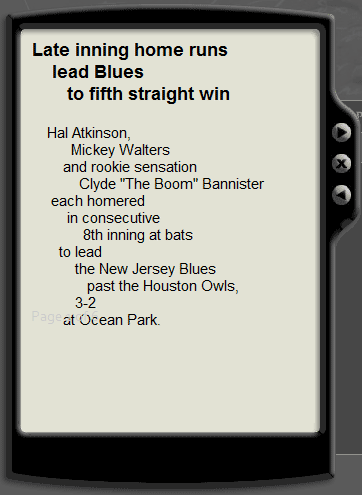
Bob Pritchett from Logos Bible Software points to Live Ink, a technology that takes normally formatted text and breaks its clauses into lines to improve reading comprehension. It looks like this:

A sports report is broken into lines: Hal Atkinson, / Mickey Walters / and rookie sensation…

Having been an English major, I keep trying to assign meaning to the line breaks—you pay close attention to line breaks when explicating poetry, and it’s hard to stop noticing them everywhere once you start noticing them in poetry. Live Ink has research to back up their reading claims; I’m not one to question their findings. So maybe I’m an anomaly, but studying the Bible in a similar format would distract me.

Speaking of things that distract me, a few years ago I came across an example (now lost on the hard drive of a deceased computer) of an interesting way of reading the Bible: one word at a time. The program cycles through the text of the Bible, showing you only one word on the screen—blink and you miss it. This Flashconverted to HTML5 in 2016 demo I just whipped up gives you the general idea:

You may need to read this post outside an RSS reader to see the demo. Not inclined? Here’s a screenshot. Picture the words rapidly scrolling upward:

The words “at my watchpost and station” are visible, with “watchpost” being the most prominent.

Honestly, I can’t decide if it’s a good idea or a bad one. The hardest part for me is that it requires more sustained concentration than I usually devote to reading. It might be useful if someone could come up with an intuitive way to control the speed and allow time to blink. Like Live Ink, it may simply take some getting used to.

(The way the demo scrolls kind of reminds me of William Shatner’s line delivery in Star Trek—it pauses slightly on longer words, which was apparently the key to Shatner’s acting in the 1960s. Actually, the line breaks in the Live Ink screenshot above remind me of how he would read a box score, too. Maybe he was just ahead of his time.)

The Tomb of Herod: Coordinates

May 8th, 2007

As you may have heard, an archaeologist has announced the possible discovery of King Herod’s tomb at Herodium, Israel.

When people announce archaeological discoveries, wouldn’t it be helpful if newspapers printed the coordinates of the discovery so you can look at the site in Google Earth? I think it would, so here they are: 31.666334N, 35.242072E

Someone created a KMZ for Google Earth (also see the forum post).

Here’s a detailed Google Earth image of the site:

Satellite image of Herodium showing the possible location of King Herod’s tomb on the northeast slope. Image copyright Google.

Here’s Herodium in a wider context (looking northeast). Jerusalem is about eight miles (13 km) north of Herodium.

View of Herodium showing the Dead Sea, Jericho, the Jordan River, the Sea of Galilee, Mount Hermon, and Jerusalem.