Blog

So You Want Small-caps, but Your Font Doesn’t Support Them

Have you wanted to typeset a Bible on screen or in print, but your preferred font doesn’t support small-caps (which is especially important for the Old Testament, where the small-caps Lord appears frequently in many translations)?

Well, if it’s a variable font, you can now try synthesizing small-caps with this quick Small-caps generator for variable fonts.

This tool tries to guess reasonable small-caps metrics for your font: it scales down the characters and increases the weight, width, and tracking to better approximate real small-caps.

Why not just use browser small-caps?

When true small-caps glyphs aren’t available, the regular CSS font-variant: small-caps declaration scales down the full-caps glyphs, leading them to appear lighter than the surrounding text. Take a look at the second line here (“Naive browser”), compared to the bottom line (the font’s built-in small-caps). This weight difference becomes especially annoying at large sizes or in running text. This example uses Source Sans.
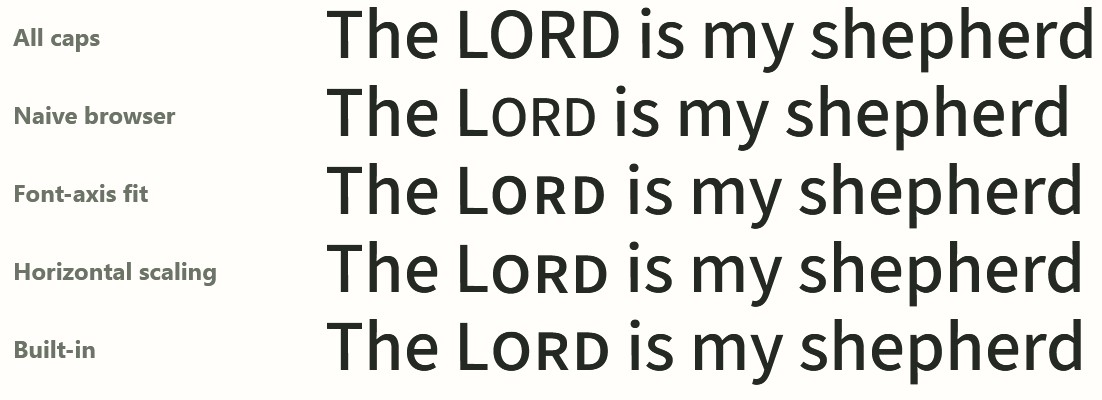
Source Sans font shows all-caps, browser small-caps, font-axis fit, horizontal scaling, and built-in. The horizontal scaling closely matches the built-in small-caps.

How does the tool decide what to change?

The weight, width, and tracking it uses are based on an analysis of the top 500 fonts on Google Fonts, 51 of which have small-caps (smcp) support built into the font.

Here’s what that distribution looks like; there’s a decent amount of variability, but it also shows that your font’s small-caps will probably fall within a certain range of possible values.
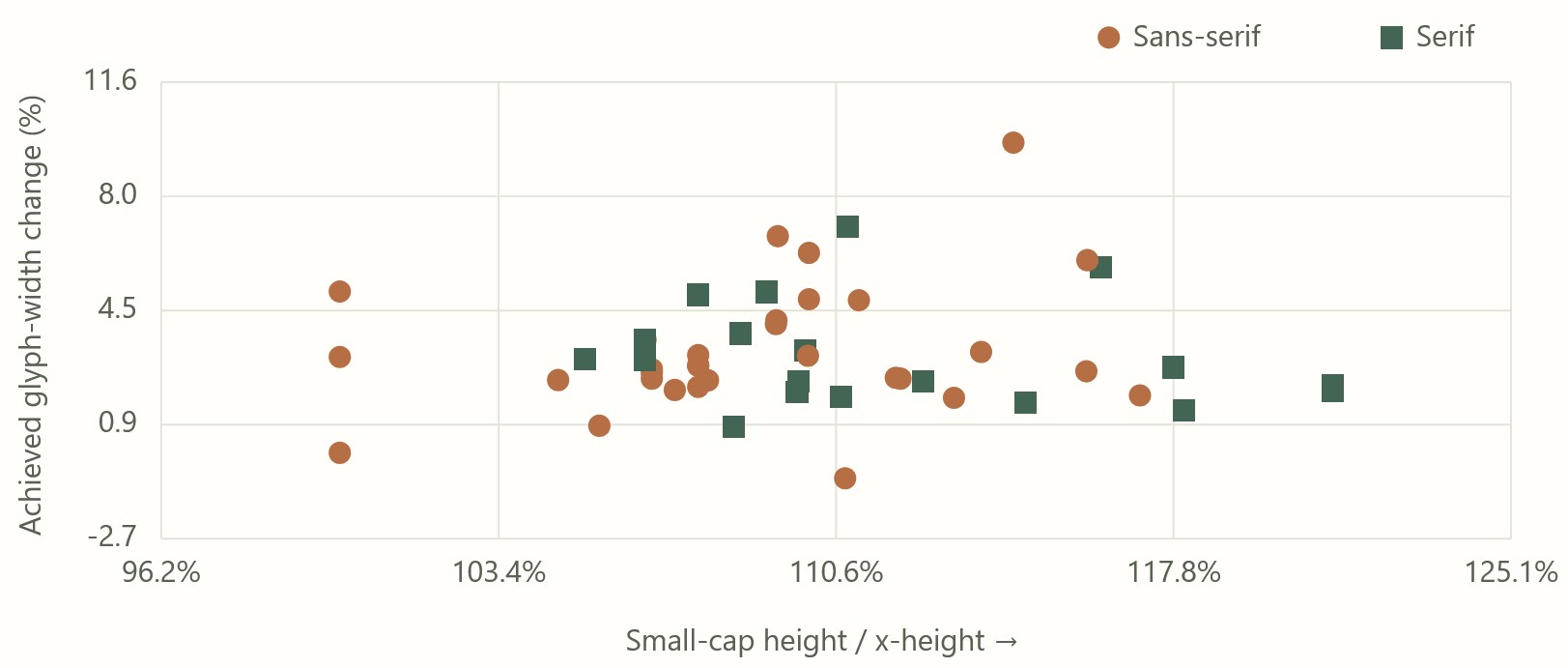
The x-axis plots the small-caps height divided by x-height; the y-axis plots the glyph width change.
Native small-caps height plotted against native small-caps width, compared to default characters. This chart shows that font designers choose to vary height and width somewhat independently when designing small-caps, but still within a clear range.

For Google Fonts where small-caps are available from the Google Fonts repo, the tool uses precomputed values to match the built-in small-caps. It’s typically within 3% error, as described on the tool’s “Outlines” tab.

Why would you want synthetic small-caps?

In a web context, Google Fonts doesn’t supply the small-caps variants. Even if your font supports them, there’s no way to make them appear. This tool provides you the code you need to make them appear, by linking to the .otf rather than the optimized .woff2 (at the cost of a much larger font file).

To avoid the larger font file, the tool also supplies the CSS needed to synthesize small-caps that look as close as possible to native small-caps. If you only need a few words to be small-caps (as is generally the case when showing Bible text, unless you’re, say, NASB), you can download a recipe that applies to just the words you need, eliminating the need for another set of glyphs.

In a print context, if you’ve chosen a font that lacks small-caps support and want to be sure you have a reasonable output, this tool gives you metrics you can use to plug into your page layout software.

Does it work?

Usually it works fine… sometimes less so. Here the default 0.048em tracking for Lora feels too loose to me; it feels better at 0.03em, which also addresses some of the awkward kerning between “O” and “R” that you see below:
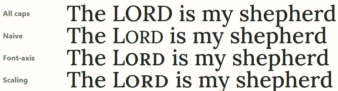
Lora has no small-caps, so the effect here is synthesized.

Sometimes the font itself (such as Dancing Script) doesn’t have enough weight variation. Even using a 400 base weight, the maximum 700 weight doesn’t fit with the lower-case letters.
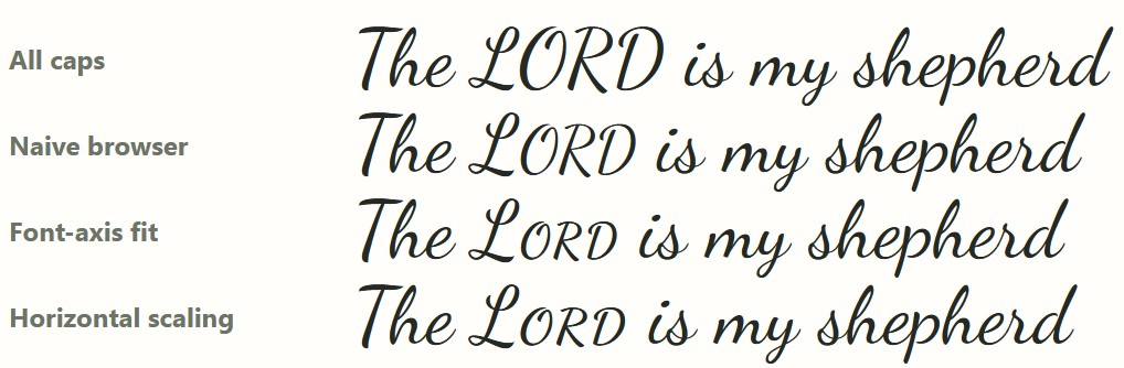
Here the small-caps look too light compared to the lower-case letters.

With monospace fonts, the font scaling throws off the spacing. I wouldn’t use this tool for monospace fonts unless you don’t want the characters to line up… in which case, why are you using a monospace font?

Other features

If the generated small-caps don’t look quite right, you can adjust a bunch of sliders to get the look you want.

You can export the CSS (though you’ll probably need to adapt the markup to match your tagging system). There are also Typst and LuaLaTex exports (neither of which I tested). You can also share your settings or copy the url for your own later reference.

You can drag your own .woff2, .otf, or .ttf into the tool, and it’ll generate results for you. All the computation happens only in your browser; the main reason for hosting it on Github instead of on this site is to show that no server-side processing is happening. I don’t want your fonts.

Try it out

If you’re a typographic purist, you may be appalled at synthesizing small-caps at all. From a practical standpoint, though, these results are better than relying on scaling alone. I hope you find this tool useful next time you’re typesetting a Bible.

GPT-6 Astra wrote this tool under my guidance.

Try it online or access the source on Github; you can run it completely locally if you like.
Posted in Code, Typography

Building an Interlinear Apocrypha in two days for $50 with AI

Try the Interlinear Apocrypha.

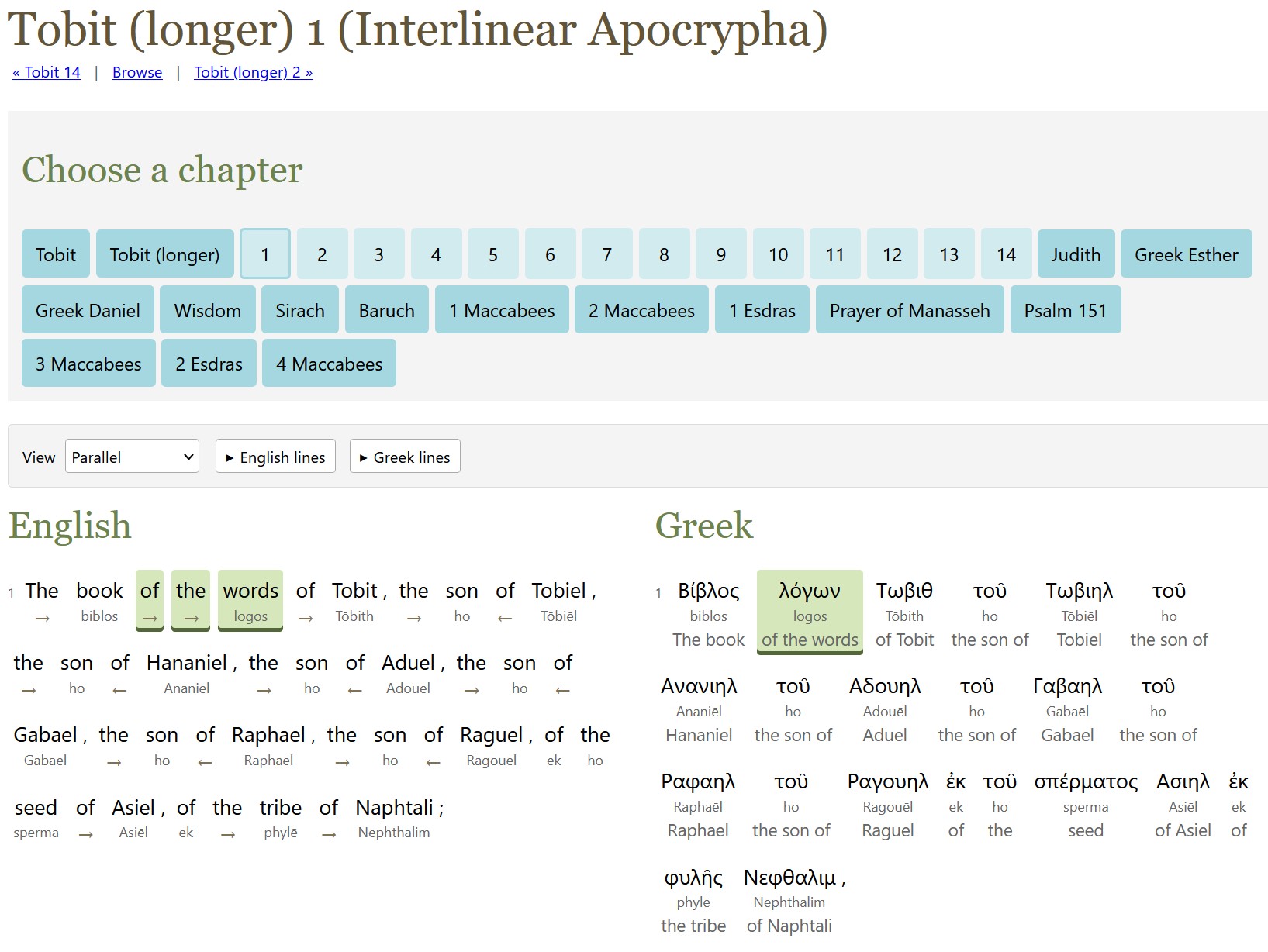
A screenshot of longer Tobit 1 in the interlinear shows highlighting between the English and the Greek.

The method to produce last week’s ASV interlinear also works for the Apocrypha (or Deuterocanonicals), which is mostly in Greek.

Unlike with the ASV alignment, this project doesn’t try to align alternate readings in the original languages; I didn’t think it was worth the processing time, though I did include the apparatus from the source texts.

The English translation is the World English Bible (WEB) because it has a translation of the Apocrypha and is freely available. (The ASV translators didn’t translate the Apocrypha.) The only exception is the longer Tobit (did you know there were two Tobits? I didn’t!), which uses D. C. Simpson’s 1913 translation because WEB only translates the shorter Tobit.

GPT-6 Astra did all the alignment work. It used a week’s worth of Pro 20x Plan tokens (thus the $50 cost). I later expanded the scope to transcribe the source apparatus (alternate manuscript readings, mostly), as described below, which cost another $15.

I used latinCy to generate the Latin parsing, with a review by Astra.

Here’s the output:

  1. The interlinear/reverse-interlinear interface, which lets you explore both English-first and original-language-first interfaces.
  2. A Git repo containing:
    1. The WEB English text tagged to the original languages (except for longer Tobit, which aligns Simpson rather than WEB).
    2. Greek and Latin text tagged to English. The versification here matches the originals rather than WEB. For example, Letter of Jeremiah is a separate book rather than WEB’s Baruch 6.
    3. Raw alignment data. As with ASV, these files are mostly the LLM talking to itself. I didn’t bother to include the scripts, which are substantially similar to the ASV ones.

Recreating the text of the Apocrypha

The Apocrypha text used is Rahlfs (1935), which the NRSVue translators say they used for most books. The Latin source text for 2 Esdras is from Bensly (1895).

While the main text was already digitized (mostly) correctly, I also decided to digitize the apparatus (which you can find in the USX files and in the original-language side of the HTML).

Here was my process for each page:

  1. GPT-6 Luna identifies the page regions in the page scans (header/footer vs. main text vs. apparatus). I ran three independent agents and took the union of the three.
  2. GPT-6 Sol transcribes the text. I used two agents for independent transcriptions. GPT-6 Luna wasn’t good enough to provide reliable transcriptions.
  3. GPT-6 Astra reconciles the Sol transcriptions and does any further work to finish the page.

It took about 30% of a week’s tokens on ChatGPT Pro 20x plan to parse around 550 pages, suggesting a potential processing rate of about 1,800 pages per week using this method. (This 30% was on top of the week’s tokens I spent on the alignment itself.)

Surprises

I asked GPT-6 Astra to reuse the ASV scripts, and I learned much later that it only sort-of complied. It missed a lot of details in adapting the scripts, which it had to reimplement later. My impression is that it rewrote these scripts from scratch instead of reusing what already existed.

About 92% of the Greek text (total words, not unique words) was able to have a Strong’s number assigned to it, thanks to TBESG. It probably could have found more, but it was spending a lot of tokens for diminishing returns.

Posted in AI, Code

Building an Interlinear for the ASV Bible in six weeks for $300 with AI

Try the ASV interlinear.

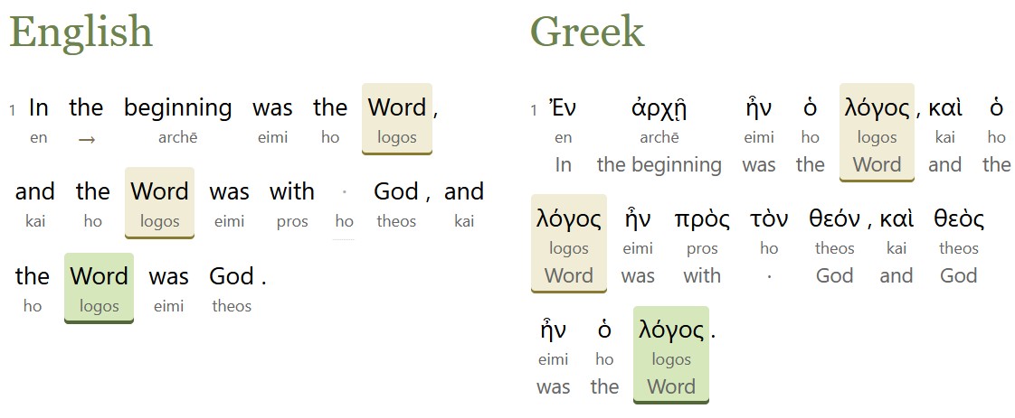
A screenshot of John 1 in the interlinear shows highlighting between the English and the Greek.

AI models are now smart enough to align English Bible translations with the original Hebrew and Greek, so why not make an alignment?

Starting with the English text of the American Standard Version (ASV) Bible from 1901, which is in the public domain, Opus 5, GPT 5.6 Sol, and GPT 6 Astra created an interlinear alignment, matching up the Hebrew and Greek original with the ASV’s modern(ish) English.

Here’s what they produced:

  1. The interlinear interface, which lets you explore both English-first and original-language-first interfaces. It also lets you see where the ASV departs from the KJV’s underlying text (155 verses).
  2. An ASV English text tagged to the original languages.
  3. A Hebrew and Greek text tagged to the ASV English. This text hypothetically reconstructs the eclectic text used by the ASV translators; textual variants that appear to have been chosen by the translators serve as the main text.
  4. Data and scripts that let you adapt this alignment process to your own text. If nothing else, the hard-won alignment rules, which went through hundreds of revisions over the course of this project and which cover all the tricky situations encountered during it, can serve as the starting point for your own alignment. LLMs love to talk about what they’re doing, and this repo records alignment reasoning down to individual verses.

Maximalist alignment philosophy

Perhaps most controversially, this project adopts a maximalist alignment philosophy, where it tries to align as much as possible, including italicized words that the ASV translators indicated as added. There are 6,250 such italic words in the ASV:

  • 3,303 are tagged as “added,” consistent with the ASV translators’ view.
  • 2,584 are tagged as part of a phrase with a different headword (the most-important word in a phrase).
  • 363 are tagged as headwords. For example, “those lands” in Judges 11:13 is translating the Hebrew pronoun for those. This alignment puts the phrase head on “lands” because it’s the most distinctive part of the phrase.

Process

Each chapter went through a three-step process:

  1. Align. The AI preps the data and does a first-pass alignment for each verse. It’s provided the alignment rules and the source text.
  2. Review. The AI looks at each verse and assesses whether the alignment is correct.
  3. Reconcile. The AI takes a larger view of the chapter, identifying inconsistencies or common themes and deciding whether to create new rules based on what it learned during this chapter.

Each chapter took about 40-60 minutes to run. Psalm 119 (the longest chapter in the Bible) took 90 minutes.

Managing cost

The hardest part of this project was managing token budgets. At first, I was parsing individual verses, which is the best way to achieve isolated alignments and reviews. But this approach exhausted my token quotas too quickly. So I switched instead to handling a full chapter at a time, which seemed to be the best balance of cost and performance.

Using this process, Claude Max or ChatGPT Pro 20x plan can process about 200-300 chapters per week before exhausting quota. ChatGPT is about 50% more efficient than Claude in terms of the number of chapters it can process per week. It took six quota-weeks to process these chapters, which is how I arrived at a $300 cost. (Traditionally, an interlinear would cost $50,000-$100,000 to produce.)

The token list prices are much higher than what I paid:

Step List Price
Align $2,300
Review $1,900
Reconcile $3,600
Total $7,800

So a 20x plan netted a 96% token discount off list prices.

I spent 100 million input tokens, 120 million output tokens, and 2.1 billion cached input tokens. With cache writes and some additional processing, the total token usage was about 2.5 billion tokens.

I also tried DeepSeek v4 and GLM 5.3, neither of which produced good results. Gemini 3.7 Flash produced fine results on alignment, but its batch API didn’t support structured outputs, which made it useless for this purpose.

Sources

This project worked from several open datasets:

  • SBLGNT, which served as the base Greek text. The variant readings in its footnotes supported 340 verses (out of just under 8,000 in the New Testament) where the ASV translators departed from the SBLGNT’s critical text (in part because the critical text is modern, while the ASV dates from 1901).
  • MACULA Hebrew and Greek for parsing data.
  • OSHB for the WLC text and verse-number differences between the Hebrew and the ASV.

I’m aware of two existing ASV alignments: Logos (2020) and STEP Bible by Wade Masfield (2013). I validated two chapters against the STEP alignment and one chapter against an NASB alignment to confirm that the AI output was sane, but I didn’t consult existing copyrighted alignments beyond these validation chapters.

Surprises

This project used an open human alignment as a gold standard. However, this data only altered two word-level alignments in the entire Bible. It added a lot of overhead to the process, since the AI mostly talked about how it disagreed with the reference because of differences in alignment philosophy. It turned out to be wasted overhead. The English glosses attached to the Hebrew and Greek mitigate this finding somewhat.

Far and away, this finding was the most-surprising part of the whole process for me: models are smart enough to do the alignment on their own, and a gold-standard, existing alignment reference is just a distraction to them, at least for this workflow.

Posted in AI, Code

Blending Herod’s Temple

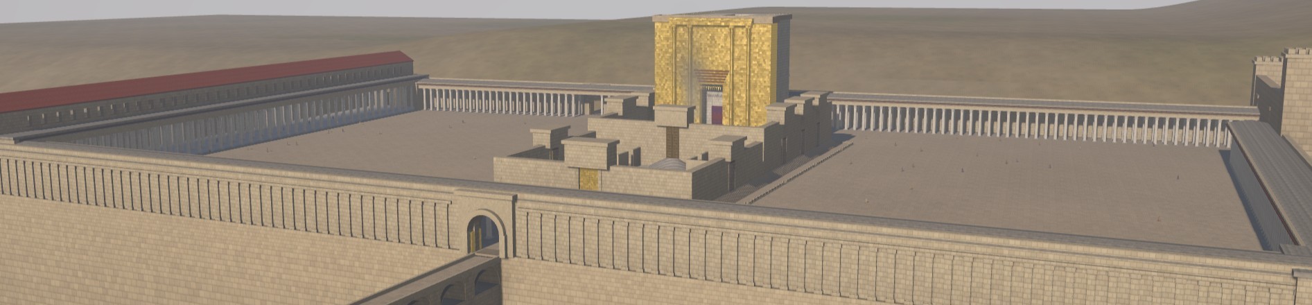
I recently wrote about using Opus 5 to create a 3D model of Herod’s Temple. Now GPT-6 Astra is out, and OpenAI is trumpeting how well it uses Blender. They’re right.

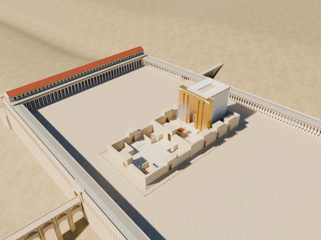
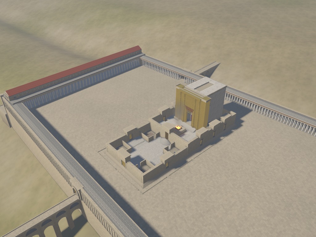
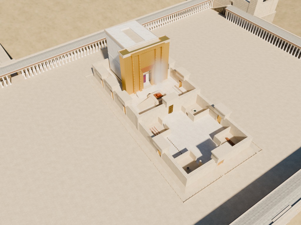
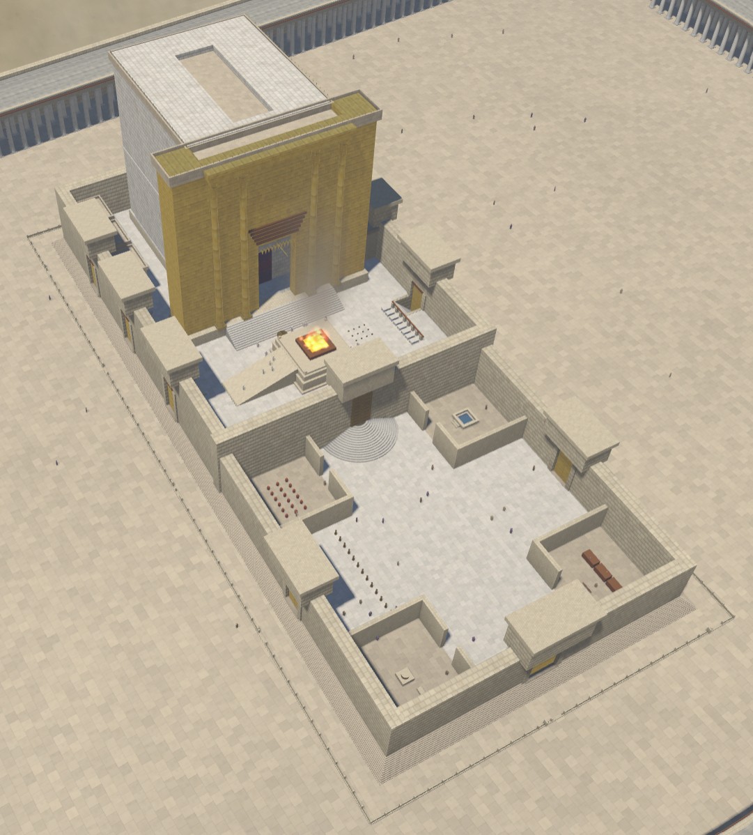
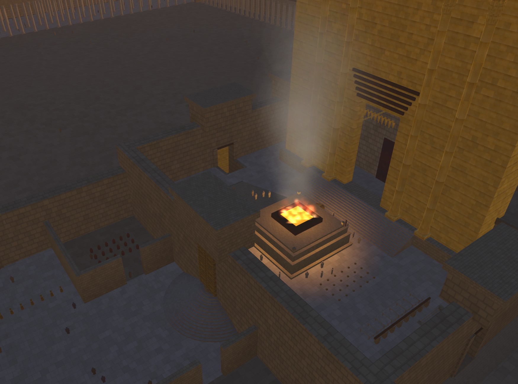
Below are some views of the Herod’s Temple model that compare the Blender version from today with the HTML version from July.

I also updated the code on Github and uploaded the model to Sketchfab so that you can use your own AI to make changes. Or maybe you have actual 3D-modeling skills and just want a starting place. In any case, feel free to use them however you want; AI-generated content isn’t copyrightable.

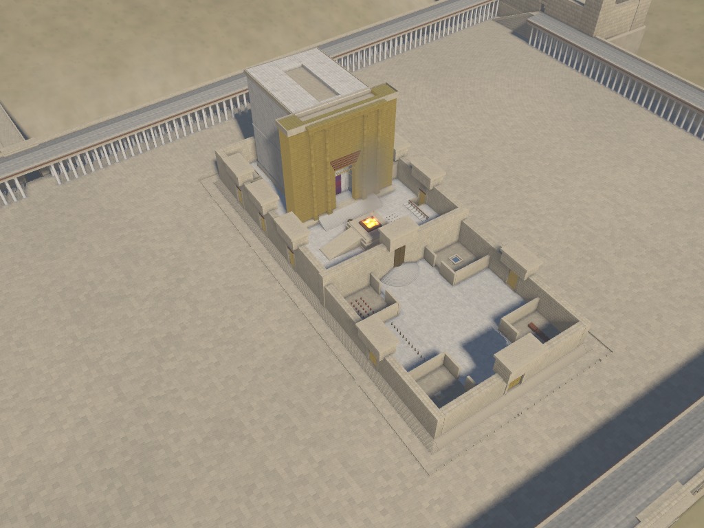
Blender Temple render, looking at the whole Temple complex from the northeast.
The Blender version is brighter and clearer, with better shadows and reflectivity.
HTML Temple render, looking at the whole Temple complex from the northeast.
The HTML version is murkier.
Blender Temple render, looking at the central sanctuary area from the southeast.
Again, the Blender version feels more realistic.
HTML Temple render, looking at the central sanctuary area from the southeast.
I do like the fire in the HTML version better, though.

Posted in Code, Geo, History, Virtual Reality

New: Place Search in Geocoding

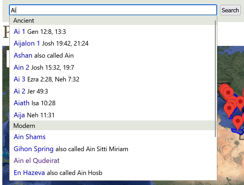
There’s now a search box in the Geocoding section of the site, which lets you search for place names (both ancient and modern) and should make this part of the site easier to navigate around:

A screenshot of the search interface shows a search for Ai with multiple possible results.

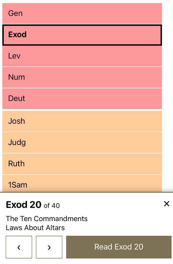
The Bible Book Browser (from 2007) also now has a touch-friendly interface:

A screenshot of the touch interface for the book browser, showing a panel at the bottom.

Obviously AI wrote these features for me. They’re part of a server upgrade: this site is now running on a server that’s twice as fast as the old one.

Also, this blog now uses Hugo instead of WordPress since I don’t need the ongoing pain that is the WordPress upgrade treadmill, not to mention the drama around the 2024 WPEngine controversy. A CMS should be drama-free. There aren’t comments anymore, unfortunately.

Posted in Geo, Labs

Clauding an Interactive 3D Model of Herod's Temple

In the announcement for Opus 5, Anthropic demoed an interactive visualization of a car in a wind tunnel. Clearly the next logical question is: can Opus 5 build an interactive visualization of Herod’s Temple complex in Jerusalem during the time of Christ?

Yes, it can. Try the interactive 3D model of Herod’s Temple it made and grab the source code to improve it.

My prompt was simple, just asking it to build a historically accurate, interactive, 3D reconstruction of the Temple. It created the model and added the interactive tour elements itself. It took about twelve hours of computate time over 25 revisions to repair geometry and (my favorite) animate the fire/smoke effect. It came up on its own with the idea of letting you change the time of day. The code is well beyond my ability and desire to understand. My revisions were mostly variations on saying, “This looks wrong. Fix it,” which is how we debug in July 2026.

The model is probably wrong on some details, though Claude argued eloquently for why it was right and scholars were wrong (such as the orientation of the steps from the plaza into the Antonia Fortress in the northwest and the existence of a causeway across the Kidron). The beauty of using an LLM and open-sourcing the code is that you can just feed it new research papers as they’re published and ask it to apply the findings to the model.

It also includes views of New Testament events that happened at the Temple, together with verse references. Claude’s text is rife with its aggressively precise tone (“Every arch ring needs its spandrel”), and I didn’t review every word it wrote. It also enjoys narrating its whole journey of discovery in code comments.

Some views:

Temple render at 9am.
A morning view from the east captures the gold reflection in the morning sun.
A render from above shows the Court of the Women, the altar, and the sanctuary.
The central Temple area.
An overhead view of the altar area, taken at simulated evening.
The glow from the altar in the evening shows off the lighting.

Try it or fork it.

Posted in Code, Geo, History, Virtual Reality

Enhancing Aerial Photos of 1917-1918 Palestine with AI

Experience the book here.

In 1925, Gustaf Dalman collected 100 (actually 101) photos taken by the German Air Force in 1917 and 1918 into the book One Hundred German Aerial Photographs of Palestine. In addition to the photos, he also described what they depicted, and he cataloged the locations of over 1,200 similar photos taken around the same time.

These photos represent the earliest published aerial photos of the Holy Land. Can AI enhance the experience? Maybe!

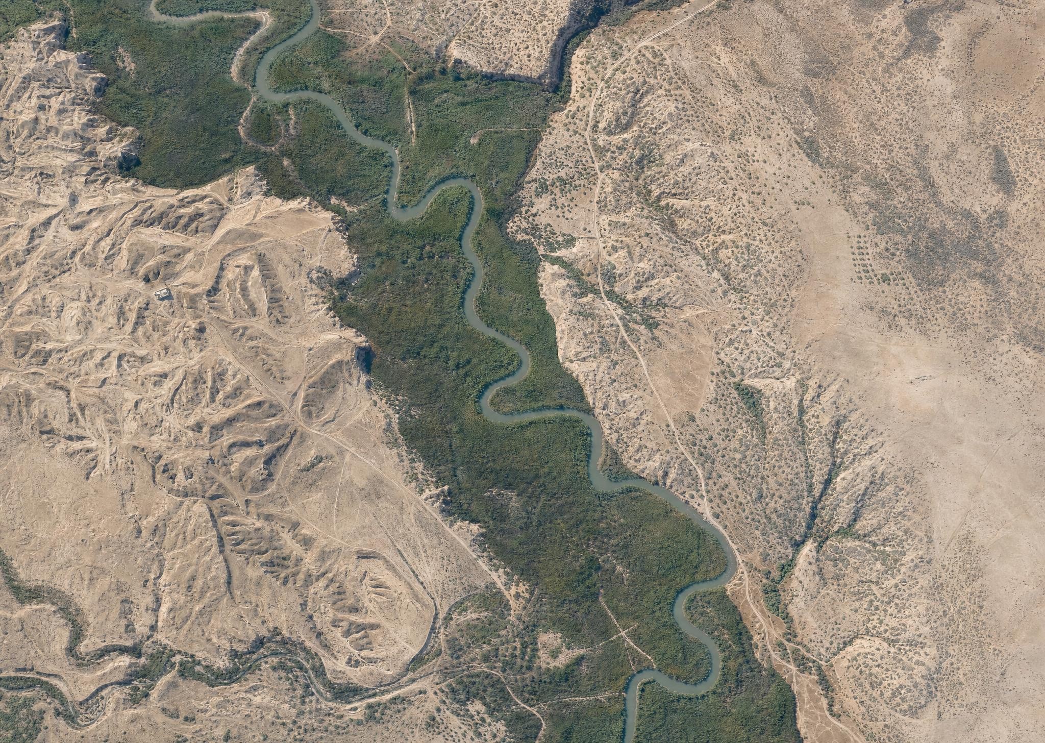
First, AI can colorize the photos. Below is what AI imagines the Jordan River looked like in March 1918, based on a historical photo. Compare it with a modern view of the same area, and you see much less vegetation across today’s Jordan Valley, with natural growth confined to a narrow strip around the Jordan’s watercourse. This kind of historical view gives you a better sense of what the area looked like in biblical times, assuming you were a bird. (The AI is also inventing sloppy details, so it’s creating immediacy at the expense of accuracy.) My instruction to the AI (GPT-Image-2) was to make each image look like it was taken with a modern iPhone.

An AI-generated interpretation of an aerial photo of the Jordan River in 1918 shows heavy forest throughout the Jordan Valley.

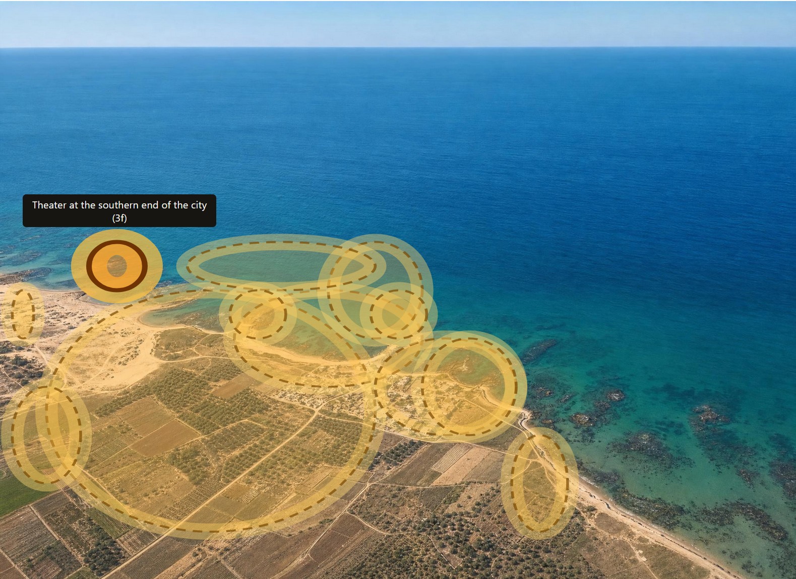
Second, AI can highlight all the features that Dalman mentions in his text. Below is Caesarea with all his annotations highlighted. Excavations at Caesarea wouldn’t happen until the 1950s, so you’re seeing the fishing village that it was at the time.

An AI interpretation of a circa-1917 photo of Caesarea shows outlines of features indicated in the text of the book, including a highlighted "Theater at the southern end of the city."

In the online book, you can click on any of the images to see the original black-and-white photos instead of the colorized AI images, if that’s how you want to roll.

Third, AI can translate the whole book from German into English. I don’t have a snappy image for you here, but it did a much better job than I would have.

Fourth, AI parsed the catalog at the end of the book so that it links to all the original photos at the Bavarian State Archives.

All the data and images for this book are in the public domain (at least in the United States), and the AI-generated images aren’t copyrightable, so you can enjoy and remix as you like. For the sake of clarity, I’m releasing the book under a CC0 license.

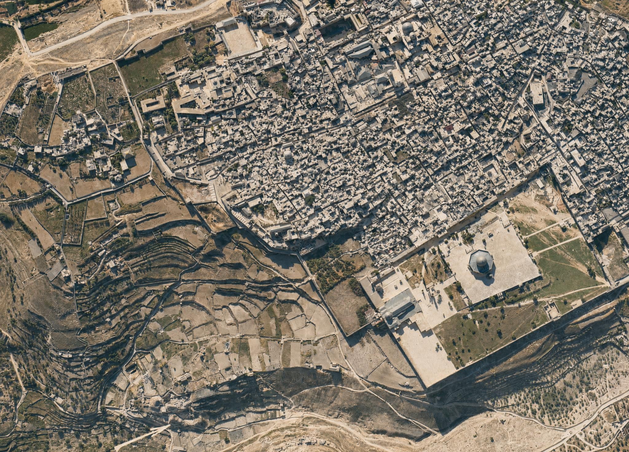
I leave you with this view of the Jerusalem’s Old City, which, again, shows much more open space than a modern view. I did have to keep reminding the AI that the Dome of the Rock didn’t have a golden dome at the time. The topography of the City of David (to the left of the Temple Mount) is clearly visible.

An AI interpretation of a 1917 aerial view of Jerusalem from above the Temple Mount focuses on the City of David.

Read the book here.

Posted in AI, Geo, History

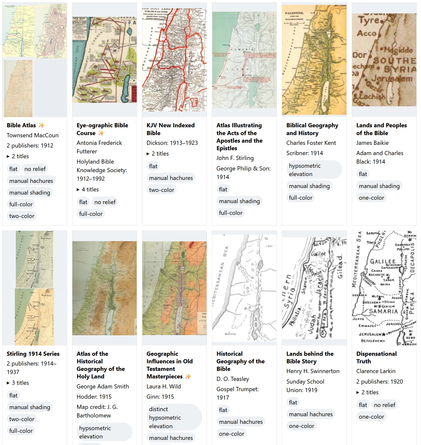
New in Labs: Survey of Bible Cartography since 1912

Two rows of Bible maps showing thumbnails and various data about them.

Go to the survey.

This survey presents over 460 distinct Bible maps from 880 sources published since 1912 and includes a thumbnail of each one to help you identify the source of a printed map you might be looking at. The images are intentionally low-resolution; they’re not designed to substitute for the original but to point you to the original. They’re also cropped from the originals to try to include Gaza in the west, the whole of the Dead Sea in the south, and Damascus in the northeast. The goal is to show you approximately the same view on every thumbnail, though doing so wasn’t possible for every map.

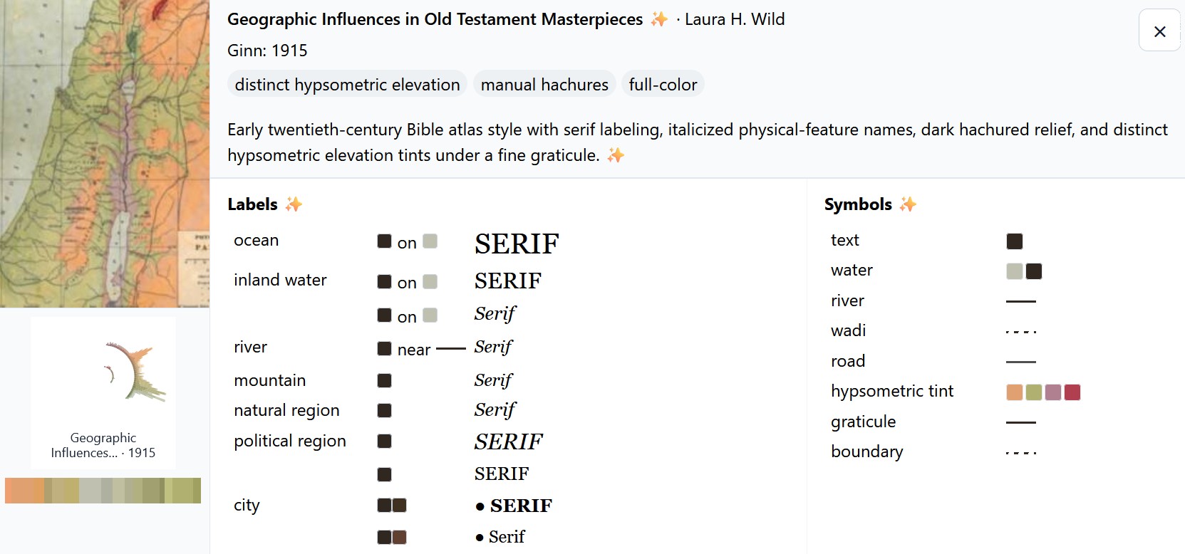
Click an image to show an AI-generated analysis of the colors and symbols used on the map. For example:

An AI-generated summary that shows the styles used in a particular map, including the labels and symbols.

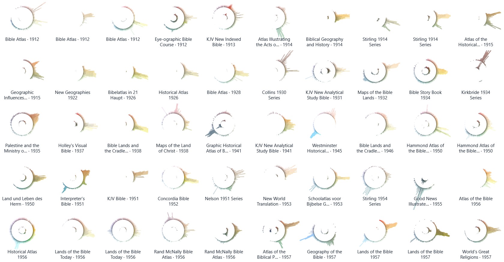
There’s also a palette view that uses radial histograms to let you compare the colors used in these maps. You can use this view to explore trends over time or to identify outliers. Amanda Hinton inspired this approach. (I thought about calling them “eyeball graphs” since the stronger dark colors of an earlier iteration of them made them resemble the pupil of an eyeball. Instead, I turned down the intensity; now they just look like concentric circles.) I also had Claude write a tool to create a circular palette with your own image.

The length of each color bar indicates the amount of that color used in the map. The outer circle shows lighter colors, and the inner circle shows darker colors. Many of the palettes use complementary or triadic color schemes that you probably learned about in school.

A series of circular palettes showing the color scheme of each map. The peaks show different colors.

In both views, you can search or filter the maps to find what you’re looking for. “Hachures” are little strokes that indicate topography, and “hypsometric elevation” means that colors change depending on the elevation.

To locate potential sources, I used WorldCat to show me all books published in English in the U.S. with the subject headings Bible—Geography—Maps and Bible—Geography. I also went through the list of study Bibles published at Theologue. While I don’t pretend that this survey is exhaustive, I was able to locate images for 95% of the relevant titles listed in WorldCat.

Because maps are relatively expensive to produce, publishers will often reuse the same basic map for decades, which you see reflected in the data. The Hammond 1977 Series, for example, was used for four decades, and the Moody 1986 Series was published in a new book as recently as 2024.

I used AI to reconstruct or enlarge images where the only source I could locate was a low-resolution image. Such images are marked.

Thank you to online Bible reviewers (especially Bible Buying Guide) for creating a historical record of what maps appeared in which Bibles. Even if you just flipped through a Bible in a YouTube video, a glimpse of a map was often enough to identify it.

Finally, if you were to combine the palettes for all these maps into a single visualization, here’s what it would look like. You can see the strong use of oranges and browns to indicate land, smaller blue peaks for water, and a bit of green for vegetation or hypsometric elevation.

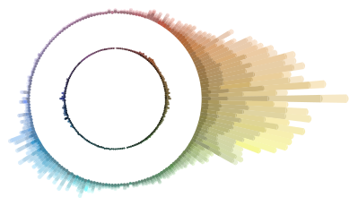
A circular palette in OKLCH colorspace showing peaks in oranges, browns, and yellows, with smaller peaks in blues and greens.

Posted in Geo

Recreating a Satellite View from the 1985 Moody Atlas of Bible Lands

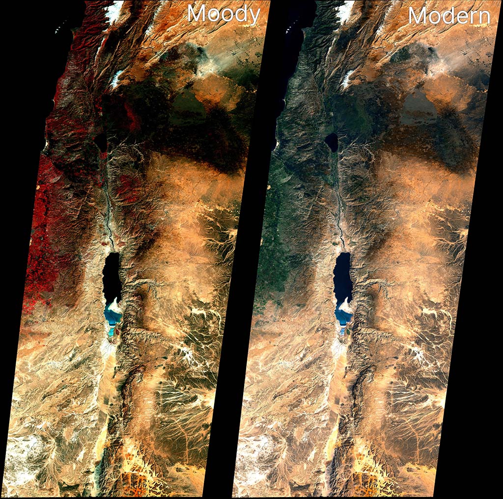
The 1985 Moody Atlas of Bible Lands by Barry J. Beitzel has a section at the end that discusses the history of biblical mapmaking. It concludes by showing a Landsat 1 image from January 1, 1973. Here’s my attempt at recreating the look of that image, alongside a more-modern take on the source data.

Landsat 1 views of modern Israel and some of Jordan and Lebanon from 1973. On the left is a recreation of the image from the Moody Atlas of Bible Lands from 1985, showing saturated colors, red vegetation, and dark areas. On the right is a more modern take, with green vegetation and less-saturated coloring.
The above image rotates the source data by 9 degrees to match the appearance in Moody. You can also download the raw geotiffs for Moody and Modern (about 20 MB each) for use in GIS applications. Resolution is about 60 meters per pixel. Find the raw data at USGS Earth Explorer.

Landsat 1 didn’t include a blue sensor (Landsat satellites wouldn’t get one until Landsat 4 in 1982), which means the blue band for a natural-looking red-green-blue (RGB) output has to be derived from other bands.

Based on the above reconstruction work, I believe Moody used Band 6 (near-infrared) for red, Band 4 (green) for green, and Band 5 (red) for blue. The strong red coloring for vegetation is often a giveaway that the NIR band was used for the red channel. This kind of false-color compositing was fairly common for the era and continues today for specific purposes (like agricultural monitoring). In the print book, the Moody image crops out most of the red vegetation, which I think is a smart move for the audience.

The Moody image is relatively dark, with more contrast than we’d expect today. My recreation here is a bit bluer than the version that appears in print, but it’s the closest I could get. The print version also merges three different scenes with slightly different color processing for each. Here I was able to merge and process the three scenes together, for a more-unified look.

This “vegetation is red” look isn’t how we process satellite imagery today for general consumption, so the second image uses a combination of Bands 4, 5, and 6 to recreate a blue channel and generate a natural-looking scene that matches modern expectations. (Specifically, it does 1.2B4 - 0.35B5 + 0.05*B6. OpenAI’s Codex, which did these transformations for me, says, “B4 carries visible-light structure closest to what we need for a blue-like channel. Subtracting B5 suppresses warm soil response that otherwise makes blue muddy. A small B6 term can stabilize tone transitions, but too much NIR in blue quickly produces unnatural color.”) It’s not as perfect as a dedicated blue sensor would be, but it comes close.

In my opinion, the Landsat 5 image from the last post is clearer than either of these images. On the other hand, it has a blue sensor to work with. Moody worked with what they had available to them, and the 1973 image they used presents an especially clear, cloud-free view.

Posted in Geo

Recreating Richard Cleave's 1993 Holy Land Satellite View

In 1993, Richard Cleave (R. L. W. Cleave) wrote The Holy Land: A Unique Perspective, which to my knowledge (and as the book jacket says) represents the first time satellite imagery was directly used as a base layer for Bible maps. He writes that his source is a Landsat 5 image from January 18, 1987: “a cold, exceptionally clear and almost cloudless morning: the best of all possible mornings for a single contemporary image of the whole area.” He uses this image throughout the book and for his two-part Holy Land Satellite Atlas in 1999, which in turn serves as the basis for the NET Bible Maps (2003).

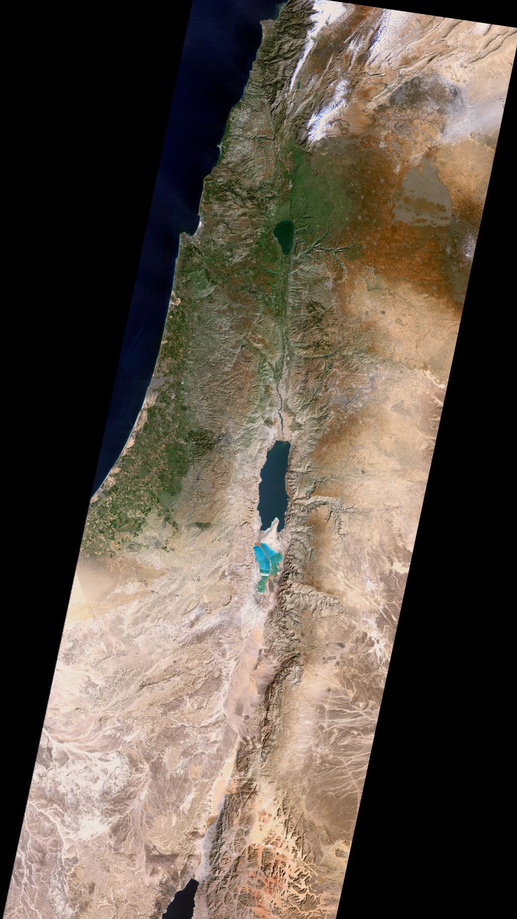
The U.S. government makes decades of Landsat imagery available, so I was curious whether it was possible to approximate Cleave’s classic look using modern methods. The answer is, “Yes, mostly”:

An attempt to match the look of Cleave's satellite imagery from 1999. This image stretches from Mount Hermon to the northern tip of the Gulf of Aqaba, and from near Gaza City to just past Damascus.
Also available as a Cloud Optimized Geotiff (40 MB) for GIS purposes and a KMZ (80 MB) for Google Earth. Both these larger images include the Sinai peninsula, though I believe Cleave used a different source image and composite method in his books for that region.

If you’ve worked with satellite imagery, you know that the data comes in “bands”—in this case, there are red, green, and blue bands—that you combine to make a final image. The decisions you make when combining these bands dramatically affect the look of the output, and there’s no objectively correct answer. I tried to come close to Cleave’s decisions from the early 1990s, but my water ended up darker and my highlights ended up brighter than his. It has a similar feel, though, down to the purple tones south of the Dead Sea. Making my matching life harder, the print colors of Cleave’s image vary depending on the book, which suggests either printing variations or multiple rendering refinements. So I tried to capture the character of the original, but it’s more of an interpretation than a copycat.

About Richard Cleave

Cleave himself sounds like a fascinating fellow. Robert North in A History of Biblical Map Making describes him in 1979: “Dr. R. L. W. Cleave of the British Navy, after serving hospitals in Jordan and becoming concerned with the lack of aerial survey material of the Holy Land, resigned his commission to accept the offer to prepare a pictorial archive for a Time-Life project. When the 1967 war intervened, he was limited to working inside Israel, and with the guidance of Père Jean Prignaud of the École Biblique he prepared and published 1500 aerial views of all major archeological and geographical features of Cisjordan. To these have already been added some 500 more views of Sinai, Göreme, and some other sites mostly in Turkey” (p. 142).

His photos consistently appeared in Bible reference works from 1967 through the late 2000s and remain high quality even compared to today’s imagery—especially since they capture a world from 60 years ago. His aerial view of the City of David represents, to me, one of the clearest ever captured. Compare a similar perspective from 2014, which shows many more buildings and is harder to parse at a glance.

Cleave worked with James Monson to produce the Student Map Manual in 1979. The ambition described in this book’s preface is astonishing for the time. Cleave’s “Wide Screen Project” describes an entire geographically indexed multimedia learning system: for the audio, cassettes; for the visual, audio-synchronized slides plus maps; for learning, the Student Map Manual, guided tours, and a poster exhibit. This proposed learning system provides a practical use for his library of thousands of photos.

In 1993, he combined 149 of these photos along with the aforementioned satellite view into The Holy Land: A Unique Perspective. The afterword to this book is also ambitious: he describes the now-common (thanks to Google Earth) practice of draping satellite imagery over a digital elevation model to produce a 3D view.

Cleave and his son Adrian worked with “John K. Hall of the Israel Geological Institute, and Gennady Agranov and Craig Gotsman, computer scientists at the Technion, Haifa” to produce these 3D images, which would premiere in National Geographic’s June 1995 issue ("Satellite Revelations: New Views of the Holy Land") and later form the core of 1999’s The Holy Land Satellite Atlas as part of RØHR Productions, Ltd. (Nicosia, Cyprus). In this 3D imagery, he uses SPOT panchromatic data to add detail (similar Landsat 7’s panchromatic band).

This work required an international team in 1993; today you can (approximately) recreate it on a home computer. Including satellite imagery in Bible maps has become somewhat more common but remains unusual. Some of Tyndale’s current maps use a subtle satellite background. The Satellite Bible Atlas (2013) relies on satellite imagery for its whole premise. The Casual English Bible maps use 3D satellite images.

But Cleave wasn’t just thinking 3D in 1993; by adding a time dimension, he was thinking 4D:

Rohr Productions is now preparing a 2 1/2 hour videotape of 3D satellite animation, specifically designed for use with this atlas. This will have a 20 minute Introduction and 13 Regional Segments, each of approximately 10 minutes duration…. The spoken commentary in the video will be descriptive, designed to reinforce the regional commentary printed in the book.

Relevant low-level aerial photographs (selected from the book) will be inserted into the “flight path,” providing familiar details of the major Biblical/historical sites and geographical features, each presented in its appropriate regional context.

Therefore all three of the most important elements in the atlas will be fully represented in the videotape: viz. the regional commentary, satellite imagery and low-level aerial photography. The videotape will provide optimal visualization and the book optimal documentation. To be fully effective, both systems are necessary.

This system anticipates multimedia accompaniments to books. He also describes using a CD-ROM to provide interactivity in a way that didn’t become popular until thirteen years later, with Google Earth’s release in 2005. The technology that underlies Google Earth didn’t even exist until 1999, at least six years after he wrote this paragraph:

In the case of the above videotape of simulated flights over the Holy Land, the actual flight paths have been predetermined for use in conjunction with the regional satellite maps in the atlas. Thus the viewer cannot alter these animation sequences in any way. Such personal intervention or “interactivity” is only possible if the 3D satellite data is supplied in digital format (on CD-ROMs), for use on the computer. Such use is already possible, of course, but only on the more powerful graphic work stations. We must still wait for comparable processing power and storage capacity in the PC world to provide this interactive option to a much wider group of Bible students, but it cannot be more than a few years away!

Cleave would ultimately produce this software. You can see some videos of a later version of it in use on YouTube. The effect is similar to Google Earth’s “tour” feature (which, again, came out more than a decade later). Here’s my recreation of the effect in Google Earth using the above image.

In all these cases—from aerial photos to multimedia education to satellite imagery to 3D views to 4D presentations to interactive explorations—Cleave saw the technological possibilities of the time and explored what they could mean for students of Bible geography.

What happened to the thousands of photos that Cleave took in the 1960s, though? Based on the hundreds he printed in his books and licensed to others, they’re very high quality and are an important historical record. Some of his posters and 3D satellite imagery remain available online (for now) in low-resolution forms, but I couldn’t find a repository of his photos. Maybe they live on as slides in a collection somewhere, waiting to be digitized and made more widely available. Until then, you can buy his books used or browse some of them on the Internet Archive.

Posted in Geo