Robert Rouse combines Bible geo data with Tableau to produce an interactive map that uses size to emphasize important places and allows you to filter the data by book:
Bible Places (As of August 2026, this visualization no longer works.)
He ’s also written a blog post that goes into detail about the map. The blog is about technology and the Bible, so take a look at his other posts if those topics interest you.
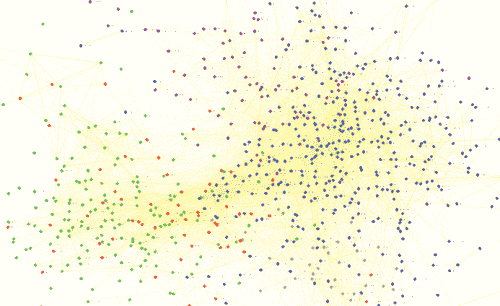
This diagram plots the similarity of pericopes (sections) in the New Testament based on their linguistic similarity in Greek:
Blue = Gospels, Purple = Acts, Green = Paul’s Epistles, Red = General Epistles, Gray = Revelation
If you don’t have Silverlight installed (or are reading this post via RSS–I suggest you click through to the original post), here’s a thumbnail:
Download the full-size PDF (300KB) or PNG (22 MB, 12,000 pixels wide).
Do we actually learn anything from this kind of diagram? The most interesting part to me is how the gospels on the right flow primarily through the Gospel of John to the epistles on the left. I wonder why that is.
Methodology
I calculated the cosine similarity between the full text of the pericopes using the Greek lemmas (after removing about forty stopwords). The pericope titles come from the ESV. I produced the diagram with Cytoscape. The widget at the top of the post comes from zoom.it, Microsoft’s Deep-Zoom-as-a-Service.