I distributed the following handout at the presentation, showing the popularity of Bible chapters and verses cited on Twitter. It displays a lot of data: darker chapters are more popular, the number in the middle of each box is the most popular verse in the chapter, and sparklines in each box show the distribution of the popularity in each chapter. (Genesis 1:1 is by far the most popular verse in Genesis 1, while Genesis 3:15 is only a little more popular than other verses in the chapter.)
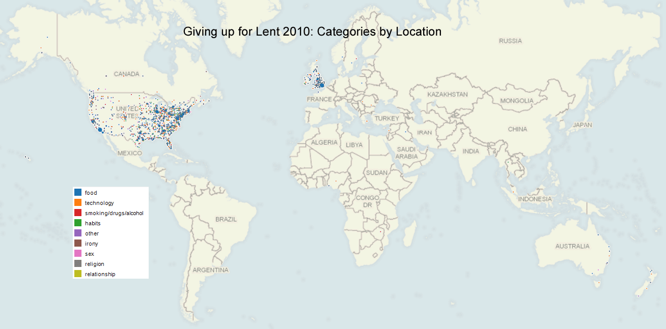
As I only track in English what people are giving up, there are concentrations in English-speaking countries.
Size indicates the relative number of Twitterers in each country giving up something for Lent.
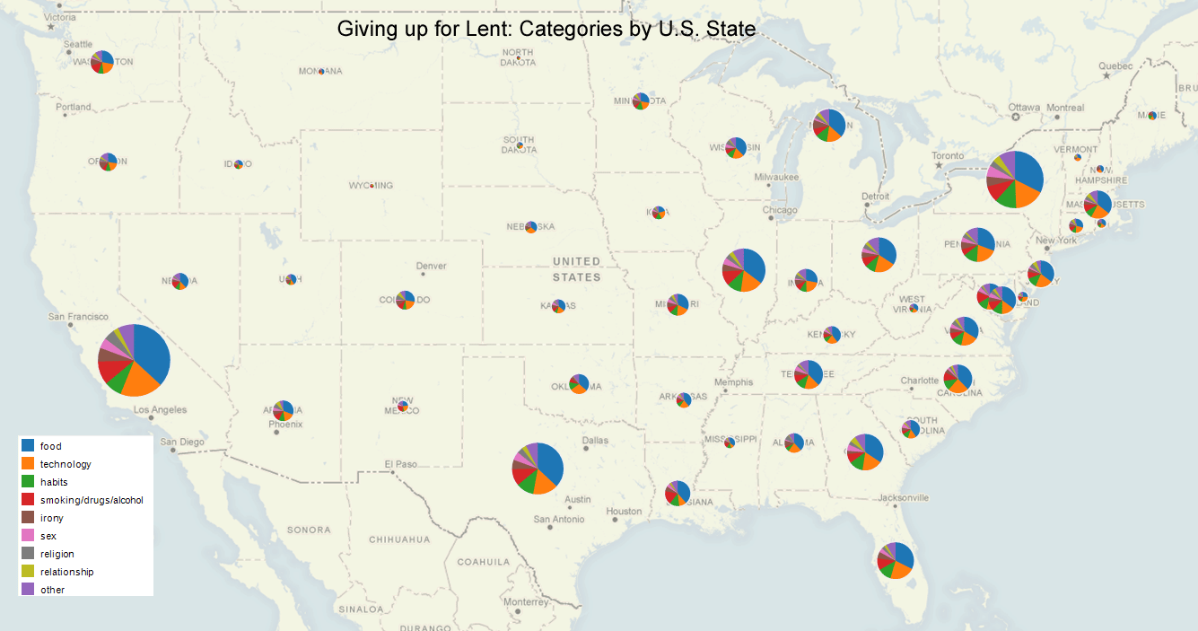
Categories of Things Given up by State
These visualizations show the differences (or lack thereof) in what people are giving up among U.S. states.
Size indicates the relative number of Twitterers in each state giving up something for Lent. Sorry, Alaska and Hawaii.
The composition of each state’s categories of tweets shows mostly minor variations among states. Some states (like Wyoming on the far right) have small numbers of tweets. I would have liked to use opacity or width to indicate this disparity but couldn’t figure out how to do it.
Comparison between 2009 and 2010
This treemap shows how the data changed between 2009 and 2010. The size of the box shows the number of people giving up each category and thing, while color indicates the percentage change from last year: dark blue indicates the steepest drop; dark orange indicates the steepest rise. The second chart shows the same data more conventionally expressed.
About the Visualizations
I created these charts mostly to explore how the new data-analysis software Tableau Public works. One of its claims to fame is that you can publish interactive visualizations to the web, a feature I didn’t take advantage of here. Tableau doesn’t do treemaps, so I used Many Eyes to create the treemap; the closest Tableau equivalent appears below the treemap.